Widgets
ALSAWidget
- class qtile_extras.widget.ALSAWidget(*args, **kwargs)[source]
The widget is very simple and, so far, just allows controls for volume up, down and mute.
Volume control is handled by running the appropriate amixer command. The widget is updated instantly when volume is changed via this code, but will also update on an interval (i.e. it will reflect changes to volume made by other programs).
The widget displays volume level via an icon, bar or both. The icon is permanently visible while the bar only displays when the volume is changed and will hide after a user-defined period.
Alternatively, if you select the popup mode then no widget will appear on the bar and, instead, a small popup will be displayed.
When using
"popup"mode, the layout of the popup can be customised via the popup_layout parameter. Users should provide a _PopupLayout object. The layout should have at least one of the following controls: aPopupSlidernamed"volume"and aPopupTextcontrol named"text"as these controls will be updated whenever the volume changes. For example, the default layout for the popup is defined as follows:VOLUME_NOTIFICATION = PopupRelativeLayout( width=200, height=50, controls=[ PopupText( text="Volume:", name="text", pos_x=0.1, pos_y=0.1, height=0.2, width=0.8, v_align="middle", h_align="center", ), PopupSlider( name="volume", pos_x=0.1, pos_y=0.3, width=0.8, height=0.8, colour_below="00ffff", bar_border_size=2, bar_border_margin=1, bar_size=6, marker_size=0, end_margin=0, ), ], )
Supported bar orientations: horizontal only
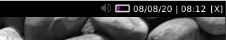
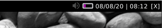
‘icon’ mode

‘bar’ mode
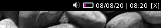
‘both’ mode
Available hooks:
key
default
description
backgroundNoneWidget background color
bar_backgroundNoneColour of bar background.
bar_colour'00ffff'Colour of bar (NB this setting may be overridden by other widget settings).
bar_colour_high'999900'Colour of bar if high range
bar_colour_loud'990000'Colour of bar in loud range
bar_colour_mute'999999'Colour of bar if muted
bar_colour_normal'009900'Colour of bar in normal range
bar_heightNoneHeight of bar (None = full bar height).
bar_text''Text to show over bar
bar_text_fontNoneFont to use for bar text
bar_text_fontsizeNoneFontsize for bar text
bar_text_foreground'ffffff'Colour for bar text
bar_width75Width of display bar
decorations[]Decorations for widgets
device'Master'Name of ALSA device
font'sans'Default font
fontsizeNoneFont size
foreground'ffffff'Font colour
hide_crashFalseDon’t display error in bar if widget crashes on startup.
hide_interval5Timeout before bar is hidden after update
icon_sizeNoneSize of the volume icon
limit_high90Max percentage for high range
limit_loud100Max percentage for loud range
limit_normal70Max percentage for normal range
mode'bar'Display mode: ‘icon’, ‘bar’, ‘both’, ‘popup’.
mouse_callbacks{}Dict of mouse button press callback functions. Accepts functions and
lazycalls.padding0Padding before icon
popup_hide_timeout5Time before popup hides
popup_layout<qtile_extras.popup.toolkit.PopupRelativeLayout object at 0x73011f268c50>Layout for popup mode
popup_show_args{'relative_to': 2, 'relative_to_bar': True, 'y': 50}Control position of popup
step5Amount to increase volume by
text_format'{volume}%'String format
theme_pathNonePath to theme icons.
update_interval5Interval to update widget (e.g. if changes made in other apps).
- commands() list[str]
Returns a list of possible commands for this object
Used by __qsh__ for command completion and online help
- doc(name) str
Returns the documentation for a specified command name
Used by __qsh__ to provide online help.
- eval(code: str) str | None
Evaluates code in the same context as this function
Return a string representing the return value of eval, or None if exec was used instead.
- function(function, *args, **kwargs) Task | None
Call a function with current object as argument
- info()
Info for this object.
- items(name: str) tuple[bool, list[str | int] | None]
Build a list of contained items for the given item class.
Exposing this allows __qsh__ to navigate the command graph.
Returns a tuple (root, items) for the specified item class, where:
root: True if this class accepts a “naked” specification without an item seletion (e.g. “layout” defaults to current layout), and False if it does not (e.g. no default “widget”).
items: a list of contained items
- show_popup()
Method to display the popup.
- toggle_mute(*args, **kwargs)
Mute audio output
- volume_down(*args, **kwargs)
Decrease volume
- volume_up(*args, **kwargs)
Increase volume


AnalogueClock
- class qtile_extras.widget.AnalogueClock(*args, **kwargs)[source]
An analogue clock for your Bar.
The size of the clock will be the size of the bar minus 2x the margin. Use
paddingto add spacing before and after the widget. Finally, the position can be fine adjusted using theadjust_x/yvalues.Supported bar orientations: horizontal and vertical
example config 
default 
face_shape='circle'
face_shape='square'key
default
description
adjust_x0Adjust the x position of the widget
adjust_y0Adjust the y position of the widget
backgroundNoneWidget background color
decorations[]Decorations for widgets
face_backgroundNoneShading for clock face
face_border_colour'00ffff'Border colour for clock face
face_border_width1Thickness of clock face border
face_shapeNone‘square’, ‘circle’ or None
hide_crashFalseDon’t display error in bar if widget crashes on startup.
hour_colour'ffffff'Colour for the hour hand
hour_length0.6Length of hour hand as percentage of radius
hour_size2Thickness of hour hand
margin2Margin around clock
minute_colour'ffffff'Colour for the minute hand
minute_length0.95Length of minute hand as percentage of radius
minute_size2Thickness of minute hand
mouse_callbacks{}Dict of mouse button press callback functions. Accepts functions and
lazycalls.padding2Additional padding at edges of widget
second_colour'ffffff'Colour for the second hand
second_length0.95Length of minute hand as percentage of radius
second_size0Thickness of second hand, 0 to hide.
update_interval1Polling interval in secs.
- commands() list[str]
Returns a list of possible commands for this object
Used by __qsh__ for command completion and online help
- doc(name) str
Returns the documentation for a specified command name
Used by __qsh__ to provide online help.
- eval(code: str) str | None
Evaluates code in the same context as this function
Return a string representing the return value of eval, or None if exec was used instead.
- function(function, *args, **kwargs) Task | None
Call a function with current object as argument
- info()
Info for this object.
- items(name: str) tuple[bool, list[str | int] | None]
Build a list of contained items for the given item class.
Exposing this allows __qsh__ to navigate the command graph.
Returns a tuple (root, items) for the specified item class, where:
root: True if this class accepts a “naked” specification without an item seletion (e.g. “layout” defaults to current layout), and False if it does not (e.g. no default “widget”).
items: a list of contained items
AnimatedImage
- class qtile_extras.widget.AnimatedImage(*args, **kwargs)[source]
A widget to display an animation when clicked.
Supported bar orientations: horizontal and vertical
key
default
description
backgroundNoneWidget background color
decorations[]Decorations for widgets
filenames[]List of image filename. Can contain ‘~’. Can also be a url.
frame_interval0.1Time between individual images
hide_crashFalseDon’t display error in bar if widget crashes on startup.
loop_count1Number of time to loop through images. 0 to loop forever.
loop_interval1Interval before restarting loop
margin3Margin inside the box
margin_xNoneX Margin. Overrides ‘margin’ if set
margin_yNoneY Margin. Overrides ‘margin’ if set
mouse_callbacks{}Dict of mouse button press callback functions. Accepts functions and
lazycalls.padding0Padding to left and right of image on horizontal bar, or above and below widget on vertical bar.
scaleTrueResize images to fit bar (as adjusted by margin settings).
- animate()
Start the animation.
- commands() list[str]
Returns a list of possible commands for this object
Used by __qsh__ for command completion and online help
- doc(name) str
Returns the documentation for a specified command name
Used by __qsh__ to provide online help.
- eval(code: str) str | None
Evaluates code in the same context as this function
Return a string representing the return value of eval, or None if exec was used instead.
- function(function, *args, **kwargs) Task | None
Call a function with current object as argument
- info()
Info for this object.
- items(name: str) tuple[bool, list[str | int] | None]
Build a list of contained items for the given item class.
Exposing this allows __qsh__ to navigate the command graph.
Returns a tuple (root, items) for the specified item class, where:
root: True if this class accepts a “naked” specification without an item seletion (e.g. “layout” defaults to current layout), and False if it does not (e.g. no default “widget”).
items: a list of contained items
- stop()
Stop the animation.
Bluetooth
- class qtile_extras.widget.Bluetooth(*args, **kwargs)[source]
Modified version of the stock Qtile widget.
The only difference is to add a context menu (on Button 3) to show options for all adapters and devices.
Supported bar orientations: horizontal and vertical
key
default
description
adapter_format'Adapter: {name} [{powered}{discovery}]'Text to display when showing adapter device.
adapter_paths[]List of DBus object path for bluetooth adapter (e.g. ‘/org/bluez/hci0’). Empty list will show all adapters.
backgroundNoneWidget background color
decorations[]Decorations for widgets
default_show_batteryFalseInclude battery level of ‘connected_devices’ in ‘default_text’. Uses ‘device_battery_format’.
default_text'BT {connected_devices}'Text to show when not scrolling through menu. Available fields: ‘connected_devices’ list of connected devices, ‘num_connected_devices’ number of connected devices, ‘adapters’ list of bluetooth adapters, ‘num_adapters’ number of bluetooth adapters.
default_timeoutNoneTime before reverting to default_text. If ‘None’, text will stay on selected item.
deviceNoneDevice path, can be found with d-feet or similar dbus explorer. When set, the widget will default to showing this device status.
device_battery_format' ({battery}%)'Text to be shown if device reports battery level
device_format'Device: {name}{battery_level} [{symbol}]'Text to display when showing bluetooth device. The
{adapterfield is also available if you’re using multiple adapters.direction'default'Override the text direction in vertical bar, has no effect on text in horizontal bar.default: text displayed based on vertical bar position (left/right)ttb: text read from top to bottom, btt: text read from bottom to top.’default’, ‘ttb’, ‘btt’
fmt'{}'Format to apply to the string returned by the widget. Main purpose: applying markup. For a widget that returns
foo, usingfmt='<i>{}</i>'would give you<i>foo</i>. To control what the widget outputs in the first place, use theformatparamater of the widget (if it has one).font'sans'Default font
fontshadowNonefont shadow color, default is None(no shadow)
fontsizeNoneFont size. Calculated if None.
foreground'ffffff'Foreground colour
hide_after0.5Time in seconds before hiding menu atfer mouse leave
hide_crashFalseDon’t display error in bar if widget crashes on startup.
hide_unnamed_devicesFalseDevices with no name will be hidden from scan results
highlight_colour'0060A0'Colour of highlight for menu items (None for no highlight)
highlight_radius5Radius for menu highlight
icon_themeNoneIcon theme for DBus menu items
markupTrueWhether or not to use pango markup
max_chars0Maximum number of characters to display in widget.
menu_background'333333'Background colour for menu
menu_border'111111'Menu border colour
menu_border_width0Width of menu border
menu_font'sans'Font for menu text
menu_fontsize12Font size for menu text
menu_foreground'ffffff'Font colour for menu text
menu_foreground_disabled'aaaaaa'Font colour for disabled menu items
menu_foreground_highlightedNoneFont colour for highlighted item (None to use menu_foreground value)
menu_icon_size12Size of icons in menu (where available)
menu_offset_x0Fine tune x position of menu
menu_offset_y0Fine tune y position of menu
menu_row_heightNoneHeight of menu row (NB text entries are 2 rows tall, separators are 1 row tall.) “None” will attempt to calculate height based on font size.
menu_width200Context menu width
mouse_callbacks{}Dict of mouse button press callback functions. Accepts functions and
lazycalls.opacity1Menu opacity
paddingNonePadding. Calculated if None.
rotateTrueRotate text in vertical bar.
scrollFalseWhether text should be scrolled. When True, you must set the widget’s
width.scroll_clearFalseWhether text should scroll completely away (True) or stop when the end of the text is shown (False)
scroll_delay2Number of seconds to pause before starting scrolling and restarting/clearing text at end
scroll_fixed_widthFalseWhen
scroll=Truethewidthparameter is a maximum width and, when text is shorter than this, the widget will resize. Settingscroll_fixed_width=Truewill force the widget to have a fixed width, regardless of the size of the text.scroll_hideFalseWhether the widget should hide when scrolling has finished
scroll_interval0.1Time in seconds before next scrolling step
scroll_repeatTrueWhether text should restart scrolling once the text has ended
scroll_step1Number of pixels to scroll with each step
separator', 'Separator for lists in ‘default_text’.
separator_colour'555555'Colour of menu separator
show_menu_iconsTrueShow icons in context menu
symbol_connected'*'Symbol to indicate device is connected
symbol_discovery('D', '')Symbols when adapter is discovering and not discovering
symbol_paired'-'Symbol to indicate device is paired but unconnected
symbol_powered('*', '-')Symbols when adapter is powered and unpowered.
symbol_unknown'?'Symbol to indicate device is unpaired
- click()
Perform default action on visible item.
- commands() list[str]
Returns a list of possible commands for this object
Used by __qsh__ for command completion and online help
- doc(name) str
Returns the documentation for a specified command name
Used by __qsh__ to provide online help.
- eval(code: str) str | None
Evaluates code in the same context as this function
Return a string representing the return value of eval, or None if exec was used instead.
- function(function, *args, **kwargs) Task | None
Call a function with current object as argument
- info()
Info for this object.
- items(name: str) tuple[bool, list[str | int] | None]
Build a list of contained items for the given item class.
Exposing this allows __qsh__ to navigate the command graph.
Returns a tuple (root, items) for the specified item class, where:
root: True if this class accepts a “naked” specification without an item seletion (e.g. “layout” defaults to current layout), and False if it does not (e.g. no default “widget”).
items: a list of contained items
- scroll_down()
Scroll down to next item.
- scroll_up()
Scroll up to next item.
- set_font(font: str | None = None, fontsize: int = 0, fontshadow: str | tuple[int, int, int] | tuple[int, int, int, float] = '', foreground: str | tuple[int, int, int] | tuple[int, int, int, float] = '', markup: bool | None = None)
Change the text layout properties and redraw the widget. This method may also be used sync attributes from the current widget with the text layout.
- show_devices(x=None, y=None, centered=False, warp_pointer=False, relative_to=1, relative_to_bar=False, hide_on_timeout=None)
Show menu with available adapters and devices.
BrightnessControl
- class qtile_extras.widget.BrightnessControl(*args, **kwargs)[source]
This module provides basic screen brightness controls and a simple widget showing the brightness level for Qtile.
Brightness control is handled by writing to the appropriate
/sys/class/backlightdevice. The widget is updated instantly when the brightness is changed via this code and will autohide after a user-defined timeout.Note
This script will not work unless the user has write access to the relevant backlight device.
This can be achieved via a udev rule which modifies the group and write permissions. The rule should be saved at /etc/udev/rules.d
An example rule is as follows:
# Udev rule to change group and write permissions for screen backlight
ACTION=="add", SUBSYSTEM=="backlight", KERNEL=="intel_backlight", RUN+="/bin/chgrp video /sys/class/backlight/%k/brightness"
ACTION=="add", SUBSYSTEM=="backlight", KERNEL=="intel_backlight", RUN+="/bin/chmod g+w /sys/class/backlight/%k/brightness"
You should then ensure that your user is a member of the
videogroup.Supported bar orientations: horizontal only

key
default
description
backgroundNoneWidget background color
bar_backgroundNoneColour of bar background.
bar_colour'008888'Colour of bar displaying brightness level.
bar_heightNoneHeight of bar (None = full bar height).
bar_text''Text to show over bar
bar_text_fontNoneFont to use for bar text
bar_text_fontsizeNoneFontsize for bar text
bar_text_foreground'ffffff'Colour for bar text
bar_width75Width of bar.
brightness_on_battery'50%'Brightness level on battery power (accepts integer value or percentage as string)
brightness_on_mains'100%'Brightness level on mains power (accepts integer valueor percentage as string)
brightness_path'brightness'Name of file holding brightness value
decorations[]Decorations for widgets
device'/sys/class/backlight/intel_backlight'Path to backlight device
enable_power_savingFalseAutomatically set brightness depending on status. Note: this is not checked when the widget is first started.
error_colour'880000'Colour of bar when displaying an error
font'sans'Default font
fontsizeNoneFont size
foreground'ffffff'Colour of text.
hide_crashFalseDon’t display error in bar if widget crashes on startup.
max_brightnessNoneSet value or leave as None to allow device maximum
max_brightness_path'max_brightness'Name of file holding max brightness value
min_brightness100Minimum brightness. Do not set to 0!
mode'bar'Display mode: ‘bar’ shows bar in widget, ‘popup’ to display a popup window
mouse_callbacks{}Dict of mouse button press callback functions. Accepts functions and
lazycalls.popup_hide_timeout5Time before popup hides
popup_layout<qtile_extras.popup.toolkit.PopupRelativeLayout object at 0x73011f109790>Layout for popup mode
popup_show_args{'relative_to': 2, 'relative_to_bar': True, 'y': 50}Control position of popup
step'5%'Amount to change brightness (accepts int or percentage as string)
text_format'{percentage}%'Text to display.
timeout_interval5Time before widet is hidden.
- brightness_down()
Decrease the brightness level
- brightness_up()
Increase the brightness level
- commands() list[str]
Returns a list of possible commands for this object
Used by __qsh__ for command completion and online help
- doc(name) str
Returns the documentation for a specified command name
Used by __qsh__ to provide online help.
- eval(code: str) str | None
Evaluates code in the same context as this function
Return a string representing the return value of eval, or None if exec was used instead.
- function(function, *args, **kwargs) Task | None
Call a function with current object as argument
- info()
Info for this object.
- items(name: str) tuple[bool, list[str | int] | None]
Build a list of contained items for the given item class.
Exposing this allows __qsh__ to navigate the command graph.
Returns a tuple (root, items) for the specified item class, where:
root: True if this class accepts a “naked” specification without an item seletion (e.g. “layout” defaults to current layout), and False if it does not (e.g. no default “widget”).
items: a list of contained items
- set_brightness_percent(percent)
Set brightness to percentage (0.0-1.0) of max value
- set_brightness_value(value)
Set brightess to set value
- show_popup()
Method to display the popup.
CPUGraph
Note
This class has just been modified to enable compatibility with features provided by qtile-extras. No new functionality has been added.
ContinuousPoll
- class qtile_extras.widget.ContinuousPoll(*args, **kwargs)[source]
A widget for displaying the continuous output from a process.
Every time a new line is output, the widget will update.
The widget takes an optional
parse_lineparameter which should be a callable object accepting alineobject. The object should return a string to be displayed in the widget. NB the line received by the object is a raw bytestring so you may want todecode()it before manipulating it. The default behaviour (i.e. with no function) is to run.decode().strip()on the text to remove any trailing new line character.Supported bar orientations: horizontal and vertical
example config 
default 
default 
parse_line=<function strip_line_prefix at 0x72254303d8a0>
parse_line=<function strip_line_prefix at 0x72254303d8a0>key
default
description
backgroundNoneWidget background color
cmdNoneCommand to execute.
decorations[]Decorations for widgets
direction'default'Override the text direction in vertical bar, has no effect on text in horizontal bar.default: text displayed based on vertical bar position (left/right)ttb: text read from top to bottom, btt: text read from bottom to top.’default’, ‘ttb’, ‘btt’
fmt'{}'Format to apply to the string returned by the widget. Main purpose: applying markup. For a widget that returns
foo, usingfmt='<i>{}</i>'would give you<i>foo</i>. To control what the widget outputs in the first place, use theformatparamater of the widget (if it has one).font'sans'Default font
fontshadowNonefont shadow color, default is None(no shadow)
fontsizeNoneFont size. Calculated if None.
foreground'ffffff'Foreground colour
hide_crashFalseDon’t display error in bar if widget crashes on startup.
markupTrueWhether or not to use pango markup
max_chars0Maximum number of characters to display in widget.
mouse_callbacks{}Dict of mouse button press callback functions. Accepts functions and
lazycalls.paddingNonePadding. Calculated if None.
parse_lineNoneFunction to parse output of line. See docs for more.
rotateTrueRotate text in vertical bar.
scrollFalseWhether text should be scrolled. When True, you must set the widget’s
width.scroll_clearFalseWhether text should scroll completely away (True) or stop when the end of the text is shown (False)
scroll_delay2Number of seconds to pause before starting scrolling and restarting/clearing text at end
scroll_fixed_widthFalseWhen
scroll=Truethewidthparameter is a maximum width and, when text is shorter than this, the widget will resize. Settingscroll_fixed_width=Truewill force the widget to have a fixed width, regardless of the size of the text.scroll_hideFalseWhether the widget should hide when scrolling has finished
scroll_interval0.1Time in seconds before next scrolling step
scroll_repeatTrueWhether text should restart scrolling once the text has ended
scroll_step1Number of pixels to scroll with each step
- commands() list[str]
Returns a list of possible commands for this object
Used by __qsh__ for command completion and online help
- doc(name) str
Returns the documentation for a specified command name
Used by __qsh__ to provide online help.
- eval(code: str) str | None
Evaluates code in the same context as this function
Return a string representing the return value of eval, or None if exec was used instead.
- function(function, *args, **kwargs) Task | None
Call a function with current object as argument
- info()
Info for this object.
- items(name: str) tuple[bool, list[str | int] | None]
Build a list of contained items for the given item class.
Exposing this allows __qsh__ to navigate the command graph.
Returns a tuple (root, items) for the specified item class, where:
root: True if this class accepts a “naked” specification without an item seletion (e.g. “layout” defaults to current layout), and False if it does not (e.g. no default “widget”).
items: a list of contained items
- run_process(command=None)
Re-run the command or provide a new command to run.
- set_font(font: str | None = None, fontsize: int = 0, fontshadow: str | tuple[int, int, int] | tuple[int, int, int, float] = '', foreground: str | tuple[int, int, int] | tuple[int, int, int, float] = '', markup: bool | None = None)
Change the text layout properties and redraw the widget. This method may also be used sync attributes from the current widget with the text layout.
- stop_process(kill=False)
Stop the running process.
CurrentLayout
- class qtile_extras.widget.CurrentLayout(*args, **kwargs)[source]
A modified version of Qtile’s
CurrentLayout.The default version behaves the same as the main qtile version of the widget. However, if you set
use_masktoTruethen you can set the colour of the icon via theforegroundparameter.Supported bar orientations: horizontal and vertical
example config 
default 
mode='icon'
use_mask=True, mode='icon', foreground='0ff'
use_mask=True, icon_first=True, mode='both', foreground='0ff'
use_mask=True, icon_first=False, mode='both', foreground=['f0f', '00f', '0ff']
use_mask=False, icon_first=True, mode='both', foreground='f0f'key
default
description
backgroundNoneWidget background color
custom_icon_paths[]List of folders where to search icons before using built-in icons or icons in ~/.icons dir. This can also be used to provide missing icons for custom layouts.
decorations[]Decorations for widgets
direction'default'Override the text direction in vertical bar, has no effect on text in horizontal bar.default: text displayed based on vertical bar position (left/right)ttb: text read from top to bottom, btt: text read from bottom to top.’default’, ‘ttb’, ‘btt’
fmt'{}'Format to apply to the string returned by the widget. Main purpose: applying markup. For a widget that returns
foo, usingfmt='<i>{}</i>'would give you<i>foo</i>. To control what the widget outputs in the first place, use theformatparamater of the widget (if it has one).font'sans'Default font
fontshadowNonefont shadow color, default is None(no shadow)
fontsizeNoneFont size. Calculated if None.
foreground'ffffff'Foreground colour
hide_crashFalseDon’t display error in bar if widget crashes on startup.
icon_firstTrueWhen
mode='both', the icon will display before the text.markupTrueWhether or not to use pango markup
max_chars0Maximum number of characters to display in widget.
mode'text'Display only the name of the layout with
textor only the icon of the layout withicon. Altenatively display the two in order withbothmouse_callbacks{}Dict of mouse button press callback functions. Accepts functions and
lazycalls.paddingNonePadding. Calculated if None.
rotateTrueRotate text in vertical bar.
scale1Icon’s scale factor relative to the bar height.
scrollFalseWhether text should be scrolled. When True, you must set the widget’s
width.scroll_clearFalseWhether text should scroll completely away (True) or stop when the end of the text is shown (False)
scroll_delay2Number of seconds to pause before starting scrolling and restarting/clearing text at end
scroll_fixed_widthFalseWhen
scroll=Truethewidthparameter is a maximum width and, when text is shorter than this, the widget will resize. Settingscroll_fixed_width=Truewill force the widget to have a fixed width, regardless of the size of the text.scroll_hideFalseWhether the widget should hide when scrolling has finished
scroll_interval0.1Time in seconds before next scrolling step
scroll_repeatTrueWhether text should restart scrolling once the text has ended
scroll_step1Number of pixels to scroll with each step
use_maskFalseUses the icon file as a mask. Icon colour will be set via the
foregroundparameter.- commands() list[str]
Returns a list of possible commands for this object
Used by __qsh__ for command completion and online help
- doc(name) str
Returns the documentation for a specified command name
Used by __qsh__ to provide online help.
- eval(code: str) str | None
Evaluates code in the same context as this function
Return a string representing the return value of eval, or None if exec was used instead.
- function(function, *args, **kwargs) Task | None
Call a function with current object as argument
- info()
Info for this object.
- items(name: str) tuple[bool, list[str | int] | None]
Build a list of contained items for the given item class.
Exposing this allows __qsh__ to navigate the command graph.
Returns a tuple (root, items) for the specified item class, where:
root: True if this class accepts a “naked” specification without an item seletion (e.g. “layout” defaults to current layout), and False if it does not (e.g. no default “widget”).
items: a list of contained items
- set_font(font: str | None = None, fontsize: int = 0, fontshadow: str | tuple[int, int, int] | tuple[int, int, int, float] = '', foreground: str | tuple[int, int, int] | tuple[int, int, int, float] = '', markup: bool | None = None)
Change the text layout properties and redraw the widget. This method may also be used sync attributes from the current widget with the text layout.
CurrentLayoutIcon
- class qtile_extras.widget.CurrentLayoutIcon(*args, **kwargs)[source]
Helper class to avoid breakages in users’ config.
In qtile, the
CurrentLayoutIconwidget was removed and combined withCurrentLayout.This class just passes the necessary arguments to
CurrentLayoutto result in the widget displaying an icon.Supported bar orientations: horizontal and vertical
example config 
default 
use_mask=True, foreground='0ff'
use_mask=True, foreground=['f0f', '00f', '0ff']key
default
description
backgroundNoneWidget background color
custom_icon_paths[]List of folders where to search icons before using built-in icons or icons in ~/.icons dir. This can also be used to provide missing icons for custom layouts.
decorations[]Decorations for widgets
direction'default'Override the text direction in vertical bar, has no effect on text in horizontal bar.default: text displayed based on vertical bar position (left/right)ttb: text read from top to bottom, btt: text read from bottom to top.’default’, ‘ttb’, ‘btt’
fmt'{}'Format to apply to the string returned by the widget. Main purpose: applying markup. For a widget that returns
foo, usingfmt='<i>{}</i>'would give you<i>foo</i>. To control what the widget outputs in the first place, use theformatparamater of the widget (if it has one).font'sans'Default font
fontshadowNonefont shadow color, default is None(no shadow)
fontsizeNoneFont size. Calculated if None.
foreground'ffffff'Foreground colour
hide_crashFalseDon’t display error in bar if widget crashes on startup.
icon_firstTrueWhen
mode='both', the icon will display before the text.markupTrueWhether or not to use pango markup
max_chars0Maximum number of characters to display in widget.
mode'text'Display only the name of the layout with
textor only the icon of the layout withicon. Altenatively display the two in order withbothmouse_callbacks{}Dict of mouse button press callback functions. Accepts functions and
lazycalls.paddingNonePadding. Calculated if None.
rotateTrueRotate text in vertical bar.
scale1Icon’s scale factor relative to the bar height.
scrollFalseWhether text should be scrolled. When True, you must set the widget’s
width.scroll_clearFalseWhether text should scroll completely away (True) or stop when the end of the text is shown (False)
scroll_delay2Number of seconds to pause before starting scrolling and restarting/clearing text at end
scroll_fixed_widthFalseWhen
scroll=Truethewidthparameter is a maximum width and, when text is shorter than this, the widget will resize. Settingscroll_fixed_width=Truewill force the widget to have a fixed width, regardless of the size of the text.scroll_hideFalseWhether the widget should hide when scrolling has finished
scroll_interval0.1Time in seconds before next scrolling step
scroll_repeatTrueWhether text should restart scrolling once the text has ended
scroll_step1Number of pixels to scroll with each step
use_maskFalseUses the icon file as a mask. Icon colour will be set via the
foregroundparameter.- commands() list[str]
Returns a list of possible commands for this object
Used by __qsh__ for command completion and online help
- doc(name) str
Returns the documentation for a specified command name
Used by __qsh__ to provide online help.
- eval(code: str) str | None
Evaluates code in the same context as this function
Return a string representing the return value of eval, or None if exec was used instead.
- function(function, *args, **kwargs) Task | None
Call a function with current object as argument
- info()
Info for this object.
- items(name: str) tuple[bool, list[str | int] | None]
Build a list of contained items for the given item class.
Exposing this allows __qsh__ to navigate the command graph.
Returns a tuple (root, items) for the specified item class, where:
root: True if this class accepts a “naked” specification without an item seletion (e.g. “layout” defaults to current layout), and False if it does not (e.g. no default “widget”).
items: a list of contained items
- set_font(font: str | None = None, fontsize: int = 0, fontshadow: str | tuple[int, int, int] | tuple[int, int, int, float] = '', foreground: str | tuple[int, int, int] | tuple[int, int, int, float] = '', markup: bool | None = None)
Change the text layout properties and redraw the widget. This method may also be used sync attributes from the current widget with the text layout.
GithubNotifications
- class qtile_extras.widget.GithubNotifications(*args, **kwargs)[source]
A widget to show when you have new github notifications.
The widget requires a personal access token (see here). The token needs the
notificationsscope to be enabled. This token should then be saved in a file and the path provided to thetoken_fileparameter.If your key expires, re-generate a new key, save it to the same file and then call the
reload_tokencommand (e.g. viaqtile cmd-obj).Required Dependencies
This module requires the following third-party libraries:
requestsSupported bar orientations: horizontal only
example config 
default Available hooks:
key
default
description
active_colour'00ffff'Colour when there are notifications
backgroundNoneWidget background color
decorations[]Decorations for widgets
error_colour'ffff00'Colour when client has an error (check logs)
hide_crashFalseDon’t display error in bar if widget crashes on startup.
icon_sizeNoneIcon size. None = autofit.
inactive_colour'ffffff'Colour when there are no notifications.
mouse_callbacks{}Dict of mouse button press callback functions. Accepts functions and
lazycalls.padding2Padding around icon.
token_file'~/.config/qtile-extras/github.token'Path to file containing personal access token.
update_interval150Number of seconds before checking status.
- commands() list[str]
Returns a list of possible commands for this object
Used by __qsh__ for command completion and online help
- doc(name) str
Returns the documentation for a specified command name
Used by __qsh__ to provide online help.
- eval(code: str) str | None
Evaluates code in the same context as this function
Return a string representing the return value of eval, or None if exec was used instead.
- function(function, *args, **kwargs) Task | None
Call a function with current object as argument
- info()
Info for this object.
- items(name: str) tuple[bool, list[str | int] | None]
Build a list of contained items for the given item class.
Exposing this allows __qsh__ to navigate the command graph.
Returns a tuple (root, items) for the specified item class, where:
root: True if this class accepts a “naked” specification without an item seletion (e.g. “layout” defaults to current layout), and False if it does not (e.g. no default “widget”).
items: a list of contained items
- reload_token()
Force reload of access token.
- update()
Trigger a check for new notifications.
GlobalMenu
- class qtile_extras.widget.GlobalMenu(*args, **kwargs)[source]
A widget to display a Global Menu (File Edit etc.) in your bar.
Only works with apps that export their menu via DBus.
Wayland support is “experimental” at best. Expect unexpected behaviour!
Required Dependencies
This module requires the following third-party libraries:
dbus-fastSupported bar orientations: horizontal only
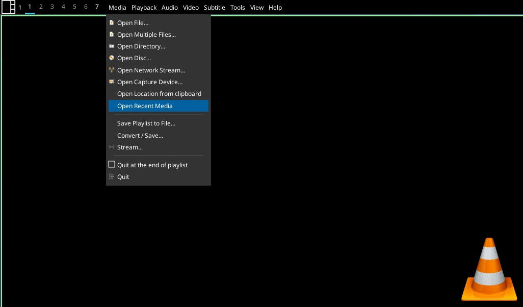
Showing VLC menu in the bar.
example config 
padding=10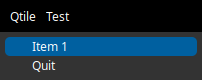
Clicking on menu items shows submenu.key
default
description
backgroundNoneWidget background color
decorations[]Decorations for widgets
direction'default'Override the text direction in vertical bar, has no effect on text in horizontal bar.default: text displayed based on vertical bar position (left/right)ttb: text read from top to bottom, btt: text read from bottom to top.’default’, ‘ttb’, ‘btt’
fmt'{}'Format to apply to the string returned by the widget. Main purpose: applying markup. For a widget that returns
foo, usingfmt='<i>{}</i>'would give you<i>foo</i>. To control what the widget outputs in the first place, use theformatparamater of the widget (if it has one).font'sans'Default font
fontshadowNonefont shadow color, default is None(no shadow)
fontsizeNoneFont size. Calculated if None.
foreground'ffffff'Foreground colour
hide_after0.5Time in seconds before hiding menu atfer mouse leave
hide_crashFalseDon’t display error in bar if widget crashes on startup.
highlight_colour'0060A0'Colour of highlight for menu items (None for no highlight)
highlight_radius5Radius for menu highlight
icon_themeNoneIcon theme for DBus menu items
markupTrueWhether or not to use pango markup
max_chars0Maximum number of characters to display in widget.
menu_background'333333'Background colour for menu
menu_border'111111'Menu border colour
menu_border_width0Width of menu border
menu_font'sans'Font for menu text
menu_fontsize12Font size for menu text
menu_foreground'ffffff'Font colour for menu text
menu_foreground_disabled'aaaaaa'Font colour for disabled menu items
menu_foreground_highlightedNoneFont colour for highlighted item (None to use menu_foreground value)
menu_icon_size12Size of icons in menu (where available)
menu_offset_x0Fine tune x position of menu
menu_offset_y0Fine tune y position of menu
menu_row_heightNoneHeight of menu row (NB text entries are 2 rows tall, separators are 1 row tall.) “None” will attempt to calculate height based on font size.
menu_width200Context menu width
mouse_callbacks{}Dict of mouse button press callback functions. Accepts functions and
lazycalls.opacity1Menu opacity
padding3Padding between items in menu bar
rotateTrueRotate text in vertical bar.
scrollFalseWhether text should be scrolled. When True, you must set the widget’s
width.scroll_clearFalseWhether text should scroll completely away (True) or stop when the end of the text is shown (False)
scroll_delay2Number of seconds to pause before starting scrolling and restarting/clearing text at end
scroll_fixed_widthFalseWhen
scroll=Truethewidthparameter is a maximum width and, when text is shorter than this, the widget will resize. Settingscroll_fixed_width=Truewill force the widget to have a fixed width, regardless of the size of the text.scroll_hideFalseWhether the widget should hide when scrolling has finished
scroll_interval0.1Time in seconds before next scrolling step
scroll_repeatTrueWhether text should restart scrolling once the text has ended
scroll_step1Number of pixels to scroll with each step
separator_colour'555555'Colour of menu separator
show_menu_iconsTrueShow icons in context menu
- commands() list[str]
Returns a list of possible commands for this object
Used by __qsh__ for command completion and online help
- doc(name) str
Returns the documentation for a specified command name
Used by __qsh__ to provide online help.
- eval(code: str) str | None
Evaluates code in the same context as this function
Return a string representing the return value of eval, or None if exec was used instead.
- function(function, *args, **kwargs) Task | None
Call a function with current object as argument
- info()
Info for this object.
- items(name: str) tuple[bool, list[str | int] | None]
Build a list of contained items for the given item class.
Exposing this allows __qsh__ to navigate the command graph.
Returns a tuple (root, items) for the specified item class, where:
root: True if this class accepts a “naked” specification without an item seletion (e.g. “layout” defaults to current layout), and False if it does not (e.g. no default “widget”).
items: a list of contained items
- set_font(font: str | None = None, fontsize: int = 0, fontshadow: str | tuple[int, int, int] | tuple[int, int, int, float] = '', foreground: str | tuple[int, int, int] | tuple[int, int, int, float] = '', markup: bool | None = None)
Change the text layout properties and redraw the widget. This method may also be used sync attributes from the current widget with the text layout.

GroupBox2
- class qtile_extras.widget.GroupBox2(*args, **kwargs)[source]
Formatting of the group box is determined by applying user-defined rules to each group.
Overview:
A rule can set any combination of the following formats:
text_colour - a string representing the hex value of the colour for the text
block_colour - a string or list of strings to fill a block
block_border_width - an integer representing the width of a block border
block_border_colour - a string representing the colour of the block border
block_corner_radius - an integer representing radius for curved corners
line_colour - a string representing the colour of a line
line_width - an integer representing the width of the line
line_position - a flag representing where the line should be drawn
image - path to an image file
custom_draw - a function that draws to the box
text - string representing text to display
box_size - integer to force the size of the individual box
visible - boolean to set visibility of box. Box will display by default unless a rule sets
visible=False
Whether a rule is applied will depend on whether it meets the relevant conditions set for each rule. A rule can set any combination of the following conditions:
Which screen the group is on (same screen as bar, different screen, no screen)
Whether the group is focused (i.e. the current group) - boolean True/False
Whether the group has windows - boolean True/False
Whether the group has any urgent windows - boolean True/False
Whether the group name matches a given string
Whether a user-defined function returns True
Rules can be inverted by using the
~operator. For example, to apply to rule when the group is not on the current screen, you can write~GroupBoxRule(text_colour="888").when(screen=GroupBoxRule.SCREEN_THIS). This is expected to be of limited use but may provide finer control in some circumstances.Rules are only rechecked when there a change to one of the following properties of the groups:
Whether the group is focused
The screen on which the group is shown
Whether the group has windows
The urgency status of the group changes
However, sometimes you may want rules to be checked more often e.g. if you’re changing properties based on the number of open windows. In this scenario, you can append
.force_check()to the rule to ensure it’s run every time.Order of drawing:
The widget draws the groupbox in the following order:
Background colour
Block
Block border
Line
Image
Custom draw function
Text
Explanation of groupbox items:
Block:
Block is a rectangle that can be filled (with
block_colour) and/or have an outline (withblock_border_widthandblock_border_colour). The corners of the rectangle can be curved by setting theblock_corner_radiusvalue.The block is positioned by using the
margin(_x)andmargin_yattributes. NB Currently, these are global for the widget and cannot be set by rules.Line:
Line is a straight line on the edge of the widget. A line will be drawn at the bottom of the box by default (when a
line_colourandline_widthhave been set). The position of lines can be changed by setting theline_positionattribute with aLinePositionflag. For example to drawn lines at the top and bottom of the box you would set theline_positionvalue to:from qtile_extras.widget.groupbox2 import GroupBoxRule GroupBoxRule.LINE_TOP | GroupBoxRule.LINE_BOTTOM
NB the line will be rendered at the edge of the box i.e. it is not currently offset by the margin value.
Image:
Image renders any image file in the box. The image will be shrunk so that the height fits within the bar and is also adjusted by the
margin(_x)andmargin(_y)attributes.Text:
A rule is able to set custom text for a group box. Where this is not set, the box will display the group’s label or name by default. Setting a value of
Nonewill prevent text from being shown.Custom draw:
You can define a function to draw directly to the box. The function should take a single argument which is the instance of the box. You can access the drawer object and its context via the
box.drawerandbox.drawer.ctxattributes.The drawing should be constrained to the rectangle defined by (x=0, y=0, width=box.size, height=box.bar.height). The origin is the top left corner.
For example, to define a rule that draws a red square in the middle of the box for occupied groups, you would do the following:
from qtile_extras.widget.groupbox2 import GroupBoxRule


def draw_red_square(box):

    w = 10
    h = 10
    x = (box.size - w) // 2
    y = (box.bar.height - h) // 2
    box.drawer.ctx.rectangle(x, y, w, h)
    box.drawer.set_source_rgb("ff0000")
    box.drawer.ctx.fill()

# Add this to your rules:
GroupBoxRule(custom_draw=draw_red_square).when(occupied=True)
Creating rules:
Creating a rule has two steps:
Setting the desired format
Setting the conditions required for that rule
To help readibility of config files, this is split so the format is set in the rule’s constructor while the conditions are set by the rule’s
when()method.For example, to set a rule that sets the font colour to cyan when a group has windows but is not focused, you would create the following rule:
from qtile_extras.widget.groupbox2 import GroupBoxRule


GroupBoxRule(text_colour="00ffff").when(focused=False, occupied=True)
#                    ^                            ^
#      Format set via constructor    Conditions set via when() method
How to match conditions:
Screen:
Matching a screen condition uses a ScreenRule object. Available options are:
GroupBoxRule.SCREEN_UNSET (default) - rule ignores screen condition
GroupBoxRule.SCREEN_THIS - group is on same screen as widget’s bar
GroupBoxRule.SCREEN_OTHER - group is a different screen to the widget’s bar
GroupBoxRule.SCREEN_ANY (same as GroupBoxRule.SCREEN_THIS | GroupBoxRule.SCREEN_OTHER) - group is on any screen
GroupBoxRule.SCREEN_NONE - group is not displayed on a screen
Group focus:
You can match a rule if the group is focused or unfocused by setting
focusedtoTrueorFalserespectively. Leaving this attribute blank will ignore focus.Group has windows:
You can match a rule if the group has windows or is empty by setting
occupiedtoTrueorFalserespectively. Leaving this attribute blank will ignore the contents of a group.Group has urgent windows:
You can match a rule if the group has or does not have any ugent windows by setting
urgenttoTrueorFalserespectively. Leaving this attribute blank will ignore the urgency state of a group.Match group name:
You can tie a rule to a specific group by setting
group_nameto the name of a particular group. Leaving this blank will ignore the group’s name.User-defined functions:
Using custom functions can extend the possibilities for customising the widget. These are set via the
funcargument.A function must take two arguments (the GroupBoxRule object and the Box object (that draws the specific box)) and return a boolean (True if the rule should be applied or False if not).
By accessing properties of the Box object, it is possible to fine tune the criteria against which the rule will match. The Box has the following attributes which may be of use here: qtile - the qtile object, group - the specific group represented by the box, bar - the Bar containing this widget.
As an example, to create a rule that is matched when a specific app is open in the group:
from qtile_extras.widget.groupbox2 import GroupBoxRule


def has_vlc(rule, box):
    for win in box.group.windows:
        if "VLC" in win.name:
            return True

    return False

# Include this in your group box rules
# Turns label a nice shade of orange if the group has a VLC window open
GroupBoxRule(text_colour="E85E00").when(func=has_vlc)
In addition, a user-defined function can set display properties dynamically. For example, to have a different icon depending on the state of the group:
from qtile_extras.widget.groupbox2 import GroupBoxRule


def set_label(rule, box):
    if box.focused:
        rule.text = "◉"
    elif box.occupied:
        rule.text = "◎"
    else:
        rule.text = "○"

    return True

# Include this in your group box rules
# NB: The function returns True so this rule will always be run
GroupBoxRule().when(func=set_label)
Rule hierarchy:
Rules are applied in a hierarchy according to the order that they appear in the rules parameter. Once a format has been set by a rule, it cannot be updated by a later rule. However, if one rule sets the text colour a later rule can still set another format (e.g. border colour). To prevent lower priority rules from setting a value, a rule can set the None value for that attribute.
For example:
from qtile_extras.widget.groupbox2 import GroupBoxRule


rules = [
    GroupBoxRule(block_colour="009999").when(screen=GroupBoxRule.SCREEN_THIS),
    GroupBoxRule(block_colour="999999").when(occupied=True),
    GroupBoxRule(text_colour="ffffff")
]
This rule will set all text white but will apply a blue block when the group is shown on the same screen as the widget even if the group is occupied. An occupied group will have a grey background provided it’s not on the same screen as the widget.
Supported bar orientations: horizontal and vertical
example config 
default 
visible_groups=['1', '2', '3', '4']
padding_x=5, rules=[<GroupBoxRule format(block_colour=00ffff) when(screen=ScreenRule.THIS)>, <GroupBoxRule format(block_border_colour=999999) when(screen=ScreenRule.OTHER)>, <GroupBoxRule format(text_colour=ffffff) when(occupied=True)>, <GroupBoxRule format(text_colour=999999) when(occupied=False)>]
padding_x=5, rules=[<GroupBoxRule format(line_colour=00ffff, line_position=LinePosition.LEFT|RIGHT) when(screen=ScreenRule.THIS)>, <GroupBoxRule format(text=+) when(occupied=True)>, <GroupBoxRule format(text=-) when(occupied=False)>, <GroupBoxRule format(text_colour=ffffff) when()>]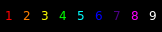
padding_x=5, rules=[<GroupBoxRule format() when(func=<function rainbow at 0x722542bc1e40>)>]
fontsize=20, padding_x=5, rules=[<GroupBoxRule format() when(func=<function set_label at 0x722542bc2340>)>, <GroupBoxRule format(text_colour=ff00ff) when(screen=ScreenRule.THIS)>, <GroupBoxRule format(text_colour=e85e00) when(screen=ScreenRule.OTHER)>, <GroupBoxRule format(text_colour=999999) when()>]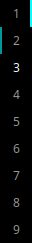
padding_y=5, rules=[<GroupBoxRule format(line_colour=00ffff, line_position=LinePosition.RIGHT) when(screen=ScreenRule.THIS)>, <GroupBoxRule format(line_colour=009999, line_position=LinePosition.LEFT) when(screen=ScreenRule.OTHER)>, <GroupBoxRule format(text_colour=ffffff) when(occupied=True)>, <GroupBoxRule format(text_colour=999999) when(occupied=False)>]key
default
description
backgroundNoneWidget background color
current_screen_focused_widthNoneSets a fixed width for the focused group on the current screen.
decorations[]Decorations for widgets
font'sans'Font to use for label.
fontshadowNoneFont shadow
fontsizeNoneFontsize for labels,
hide_crashFalseDon’t display error in bar if widget crashes on startup.
invert_mouse_wheelFalseWhether to invert mouse wheel group movement
margin3Margin inside the box
margin_xNoneX Margin. Overrides ‘margin’ if set
margin_yNoneY Margin. Overrides ‘margin’ if set
markupFalseUse markup.
mouse_callbacks{}Dict of mouse button press callback functions. Accepts functions and
lazycalls.padding3Padding inside the box
padding_xNoneX Padding. Overrides ‘padding’ if set
padding_yNoneY Padding. Overrides ‘padding’ if set
rules[<GroupBoxRule format(line_colour=00ffff) when(screen=ScreenRule.THIS)>, <GroupBoxRule format(line_colour=999999) when(screen=ScreenRule.OTHER)>, <GroupBoxRule format(text_colour=ffffff) when(occupied=True)>, <GroupBoxRule format(text_colour=999999) when(occupied=False)>]Rules for determining how to format group box. See docstring for fuller explanation.
use_mouse_wheelTrueWhether to use mouse wheel events
visible_groupsNoneList of names of groups to show in widget. ‘None’ (default) to show all groups.
- commands() list[str]
Returns a list of possible commands for this object
Used by __qsh__ for command completion and online help
- doc(name) str
Returns the documentation for a specified command name
Used by __qsh__ to provide online help.
- eval(code: str) str | None
Evaluates code in the same context as this function
Return a string representing the return value of eval, or None if exec was used instead.
- function(function, *args, **kwargs) Task | None
Call a function with current object as argument
- items(name: str) tuple[bool, list[str | int] | None]
Build a list of contained items for the given item class.
Exposing this allows __qsh__ to navigate the command graph.
Returns a tuple (root, items) for the specified item class, where:
root: True if this class accepts a “naked” specification without an item seletion (e.g. “layout” defaults to current layout), and False if it does not (e.g. no default “widget”).
items: a list of contained items
HDDBusyGraph
Note
This class has just been modified to enable compatibility with features provided by qtile-extras. No new functionality has been added.
HDDGraph
Note
This class has just been modified to enable compatibility with features provided by qtile-extras. No new functionality has been added.
IWD
- class qtile_extras.widget.IWD(*args, **kwargs)[source]
This widget provides information about your wireless connection using iwd.
The widget also allows you to scan for and connect to different networks. If the network is unknown (i.e. you haven’t connected to it before), the widget will launch a window to enter the password (using zenity by default).
NB you cannot join 802.1x networks unless they have already been configured.
Supported bar orientations: horizontal and vertical
example config 
default 
show_image=True, show_text=False
show_image=True, show_text=False, wifi_shape='rectangle', wifi_rectangle_width=10key
default
description
active_colour'ffffff'Colour for wifi strength.
backgroundNoneWidget background color
check_connection_interval0Interval to check if device connected to internet (0 to disable)
decorations[]Decorations for widgets
direction'default'Override the text direction in vertical bar, has no effect on text in horizontal bar.default: text displayed based on vertical bar position (left/right)ttb: text read from top to bottom, btt: text read from bottom to top.’default’, ‘ttb’, ‘btt’
disconnected_colour'aa0000'Colour when device has no internet connection
fmt'{}'Format to apply to the string returned by the widget. Main purpose: applying markup. For a widget that returns
foo, usingfmt='<i>{}</i>'would give you<i>foo</i>. To control what the widget outputs in the first place, use theformatparamater of the widget (if it has one).font'sans'Default font
fontshadowNonefont shadow color, default is None(no shadow)
fontsizeNoneFont size. Calculated if None.
foreground'ffffff'Foreground colour
format'{ssid} ({quality}%)'Text format. Available fields: ssid, rssi, quality
hide_after0.5Time in seconds before hiding menu atfer mouse leave
hide_crashFalseDon’t display error in bar if widget crashes on startup.
highlight_colour'0060A0'Colour of highlight for menu items (None for no highlight)
highlight_radius5Radius for menu highlight
icon_themeNoneIcon theme for DBus menu items
inactive_colour'666666'Colour for wifi background.
interfaceNoneName of wireless interface. You should only need to set this if you have more than one wireless adapter on your system.
internet_check_host'8.8.8.8'IP adddress to check for internet connection
internet_check_port53Port to check for internet connection
internet_check_timeout5Period before internet check times out and widget reports no internet connection.
margin3Margin inside the box
margin_xNoneX Margin. Overrides ‘margin’ if set
margin_yNoneY Margin. Overrides ‘margin’ if set
markupTrueWhether or not to use pango markup
max_chars0Maximum number of characters to display in widget.
menu_background'333333'Background colour for menu
menu_border'111111'Menu border colour
menu_border_width0Width of menu border
menu_font'sans'Font for menu text
menu_fontsize12Font size for menu text
menu_foreground'ffffff'Font colour for menu text
menu_foreground_disabled'aaaaaa'Font colour for disabled menu items
menu_foreground_highlightedNoneFont colour for highlighted item (None to use menu_foreground value)
menu_icon_size12Size of icons in menu (where available)
menu_offset_x0Fine tune x position of menu
menu_offset_y0Fine tune y position of menu
menu_row_heightNoneHeight of menu row (NB text entries are 2 rows tall, separators are 1 row tall.) “None” will attempt to calculate height based on font size.
menu_width200Context menu width
mouse_callbacks{}Dict of mouse button press callback functions. Accepts functions and
lazycalls.opacity1Menu opacity
paddingNonePadding. Calculated if None.
password_entry_app'zenity'Application for password entry.
password_entry_args['--entry', '--text', 'Enter password:', '--hide-text']Additional args to pass to password entry command.
rotateTrueRotate text in vertical bar.
scanning_colour'3abb3a'Colour to use for image when scanning is active.
scrollFalseWhether text should be scrolled. When True, you must set the widget’s
width.scroll_clearFalseWhether text should scroll completely away (True) or stop when the end of the text is shown (False)
scroll_delay2Number of seconds to pause before starting scrolling and restarting/clearing text at end
scroll_fixed_widthFalseWhen
scroll=Truethewidthparameter is a maximum width and, when text is shorter than this, the widget will resize. Settingscroll_fixed_width=Truewill force the widget to have a fixed width, regardless of the size of the text.scroll_hideFalseWhether the widget should hide when scrolling has finished
scroll_interval0.1Time in seconds before next scrolling step
scroll_repeatTrueWhether text should restart scrolling once the text has ended
scroll_step1Number of pixels to scroll with each step
separator_colour'555555'Colour of menu separator
show_imageFalseShows a graphical representation of signal strength.
show_menu_iconsTrueShow icons in context menu
show_textTrueDisplays text in bar.
update_interval2Polling interval in seconds.
wifi_arc75Angle of arc in degrees.
wifi_rectangle_width5Width of rectangle in pixels.
wifi_shape'arc'‘arc’ or ‘rectangle’
- commands() list[str]
Returns a list of possible commands for this object
Used by __qsh__ for command completion and online help
- doc(name) str
Returns the documentation for a specified command name
Used by __qsh__ to provide online help.
- eval(code: str) str | None
Evaluates code in the same context as this function
Return a string representing the return value of eval, or None if exec was used instead.
- function(function, *args, **kwargs) Task | None
Call a function with current object as argument
- info()
Info for this object.
- items(name: str) tuple[bool, list[str | int] | None]
Build a list of contained items for the given item class.
Exposing this allows __qsh__ to navigate the command graph.
Returns a tuple (root, items) for the specified item class, where:
root: True if this class accepts a “naked” specification without an item seletion (e.g. “layout” defaults to current layout), and False if it does not (e.g. no default “widget”).
items: a list of contained items
- scan()
- set_font(font: str | None = None, fontsize: int = 0, fontshadow: str | tuple[int, int, int] | tuple[int, int, int, float] = '', foreground: str | tuple[int, int, int] | tuple[int, int, int, float] = '', markup: bool | None = None)
Change the text layout properties and redraw the widget. This method may also be used sync attributes from the current widget with the text layout.
- show_networks(x=None, y=None, centered=False, warp_pointer=False, relative_to=1, relative_to_bar=False, hide_on_timeout=None)
Show menu with available networks.
Image
- class qtile_extras.widget.Image(*args, **kwargs)[source]
A modified version of Qtile’s
Imagewidget.The two key differences are: 1) The widget accepts a url and will download the image from the internet. 2) The image can be used as a mask and filled with a user-defined colour.
Supported bar orientations: horizontal and vertical
key
default
description
adjust_x0Fine x-axis adjustment of icon position
adjust_y0Fine y-axis adjustment of icon position
backgroundNoneWidget background color
colour'ffffff'Colour to paint maksed image
decorations[]Decorations for widgets
filenameNoneImage filename. Can contain ‘~’. Can also be a url.
hide_crashFalseDon’t display error in bar if widget crashes on startup.
margin0Margin inside the box. Defaults to 0.
margin_xNoneX Margin. Overrides ‘margin’ if set
margin_yNoneY Margin. Overrides ‘margin’ if set
maskFalseUse the image as a mask and fill with
colour.mouse_callbacks{}Dict of mouse button press callback functions. Accepts functions and
lazycalls.padding0Padding to left and right of image on horizontal bar, or above and below widget on vertical bar.
rotate0.0rotate the image in degrees counter-clockwise
scaleTrueEnable/Disable image scaling
- commands() list[str]
Returns a list of possible commands for this object
Used by __qsh__ for command completion and online help
- doc(name) str
Returns the documentation for a specified command name
Used by __qsh__ to provide online help.
- eval(code: str) str | None
Evaluates code in the same context as this function
Return a string representing the return value of eval, or None if exec was used instead.
- function(function, *args, **kwargs) Task | None
Call a function with current object as argument
- info()
Info for this object.
- items(name: str) tuple[bool, list[str | int] | None]
Build a list of contained items for the given item class.
Exposing this allows __qsh__ to navigate the command graph.
Returns a tuple (root, items) for the specified item class, where:
root: True if this class accepts a “naked” specification without an item seletion (e.g. “layout” defaults to current layout), and False if it does not (e.g. no default “widget”).
items: a list of contained items
- update(filename)
LiveFootballScores
- class qtile_extras.widget.LiveFootballScores(*args, **kwargs)[source]
The module uses a module I wrote a number of years ago that parses data from the BBC Sport website.
You can select more than one team and league. Scores can be scrolled by using the mousewheel over the widget.
Goals and red cards are indicated by a coloured bar next to the relevant team name. The match status is indicated by a coloured bar underneath the match summary. All colours are customisable.
Right-clicking the widget will bring up a list of all matches that meet your selected criteria. Clicking on any of those matches will open a popup showing more detail.
The popup can be accessed directly by the
show_detail()command. When this is used, the selected match is the one currently visible in the widget.Required Dependencies
This module requires the following third-party libraries:
requestsSupported bar orientations: horizontal only
example config 
team='Chelsea', teams=['Liverpool', 'Real Madrid'], leagues=['premier-league', 'FIFA World Cup']
Clicking on widget cycles through: match time...
Home goal scorers...
Away goal scorers...
Competition name.
Scrolling shows different matches.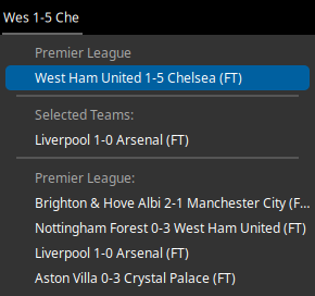
Showing list of all followed matches.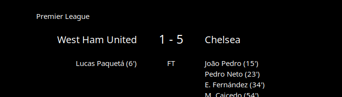
Showing detail for single match.Available hooks:
key
default
description
always_show_redTrueContinue to show red card indicator
backgroundNoneWidget background color
decorations[]Decorations for widgets
font'sans'Default font
fontsizeNoneFont size
foreground'ffffff'Text colour
goal_indicator'009999'Colour of line to show team that scores
hide_after0.5Time in seconds before hiding menu atfer mouse leave
hide_crashFalseDon’t display error in bar if widget crashes on startup.
highlight_colour'0060A0'Colour of highlight for menu items (None for no highlight)
highlight_radius5Radius for menu highlight
icon_themeNoneIcon theme for DBus menu items
info_text['{T:^12}', '{H:.3}: {G:10}', '{A:.3}: {g:10}', '{C}']n Add extra text lines which can be displayed by clicking on widget.n Available fields are:n {H}: Home Team namen {A}: Away Team namen {h}: Home scoren {a}: Away scoren {C}: Competitionn {v}: Venuen {T}: Display time (kick-off, elapsed time, HT, FT)n {S}: Status (as above but no elapsed time)n {G}: Home goalscorersn {g}: Away goalscorersn {R}: Home red cardsn {r}: Away red cardsn
info_timeout5Time before reverting to default text
leagues[]List of leagues you want to display
margin3Margin inside the box
margin_xNoneX Margin. Overrides ‘margin’ if set
margin_yNoneY Margin. Overrides ‘margin’ if set
menu_background'333333'Background colour for menu
menu_border'111111'Menu border colour
menu_border_width0Width of menu border
menu_font'sans'Font for menu text
menu_fontsize12Font size for menu text
menu_foreground'ffffff'Font colour for menu text
menu_foreground_disabled'aaaaaa'Font colour for disabled menu items
menu_foreground_highlightedNoneFont colour for highlighted item (None to use menu_foreground value)
menu_icon_size12Size of icons in menu (where available)
menu_offset_x0Fine tune x position of menu
menu_offset_y0Fine tune y position of menu
menu_row_heightNoneHeight of menu row (NB text entries are 2 rows tall, separators are 1 row tall.) “None” will attempt to calculate height based on font size.
menu_width300Width of menu showing all matches
mouse_callbacks{}Dict of mouse button press callback functions. Accepts functions and
lazycalls.opacity1Menu opacity
popup_display_timeout10Seconds to show recordings.
popup_font'monospace'Font to use for displaying upcoming recordings. A monospace font is recommended
popup_hide_timeout0Number of seconds before popup is hidden (0 to disable).
popup_layout<qtile_extras.popup.toolkit.PopupRelativeLayout object at 0x73011e87a2d0>Layout to use for extended match information
popup_show_args{'centered': True, 'hide_on_timeout': 5}Arguments to set behaviour of extended popup
popup_text'{H:.20} {h}-{a} {A:.20} ({T:.5})'Format to use for popup window.
red_card_indicator'bb0000'Colour of line to show team has had a player sent off.
refresh_interval60Time to update data
separator_colour'555555'Colour of menu separator
show_menu_iconsTrueShow icons in context menu
startup_delay30Time before sending first web request
status_fixture'000000'Colour when match has not started
status_fulltime'666666'Colour when match has ended
status_halftime'aaaa00'Colour when half time
status_live'008800'Colour when match is live
status_text'{H:.3} {h}-{a} {A:.3}'Default widget match text
team'Liverpool'Team whose scores you want to display
teams[]List of other teams you want to display
underline_statusTrueBar at bottom of widget to indicate status.
- commands() list[str]
Returns a list of possible commands for this object
Used by __qsh__ for command completion and online help
- doc(name) str
Returns the documentation for a specified command name
Used by __qsh__ to provide online help.
- eval(code: str) str | None
Evaluates code in the same context as this function
Return a string representing the return value of eval, or None if exec was used instead.
- function(function, *args, **kwargs) Task | None
Call a function with current object as argument
- get()
Get displayed text. Removes padding.
- info()
Show information about all matches
- items(name: str) tuple[bool, list[str | int] | None]
Build a list of contained items for the given item class.
Exposing this allows __qsh__ to navigate the command graph.
Returns a tuple (root, items) for the specified item class, where:
root: True if this class accepts a “naked” specification without an item seletion (e.g. “layout” defaults to current layout), and False if it does not (e.g. no default “widget”).
items: a list of contained items
- loop_match_info(step: int = 1)
Show text info on match.
- next_match()
- popup()
Display window listing all matches
- previous_match()
- reboot()
Sometimes the widget won’t update (and I don’t know why). This method should reset everything and start the widget again.
- Can be bound to a key e.g.:
lazy.widget[“livefootballscores”].reboot
- refresh()
Force a poll of match data.
- show_detail()
Displays popup showing detailed info about match.
- show_matches(x=None, y=None, centered=False, warp_pointer=False, relative_to=1, relative_to_bar=False, hide_on_timeout=None)
Show menu with followed matchs.
- show_popup()
Method to display the popup.
MemoryGraph
Note
This class has just been modified to enable compatibility with features provided by qtile-extras. No new functionality has been added.
Mpris2
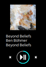
- class qtile_extras.widget.Mpris2(*args, **kwargs)[source]
Modified version of the base Mpris2 widget.
This version adds a popup with player controls. Users can provide a custom template for the popup using the
popup_layoutparameter.The popup can be toggled with the
toggle_playercommand.The following fields are available (controls should set their ‘name’ to this value):
‘title’: Track title
‘artist’: Track artist
‘album’: Album name
‘player’: Media player name
‘artwork’: Path to artwork (to be used with a PopupImage control)
‘progress’: Progress through thrack (to be used with a PopupSlider control)
‘position’: Current playback position e.g. ‘03:40’
‘length’: Track length e.g. ‘05:15’
‘time’: String showing position and total length e.g. ‘03:40 / 05:15’
To control playback, the template should have controls named:
‘play_pause’
‘stop’
‘previous’
‘next’
When shown, the controls can be selected using the mouse or keyboard navigation. The popup can be hidden by pressing <escape> or by calling the
toggle_playercommand.Two pre-defined layouts are currently provided and can be loadeded via:
from qtile_extras import widget
from qtile_extras.popup.templates.mpris2 import COMPACT_LAYOUT, DEFAULT_LAYOUT

...

# NB DEFAULT_LAYOUT is included by default and does not need to be imported in
# your config
widget.Mpris2(popup_layout=COMPACT_LAYOUT)
The layouts look like this:
DEFAULT_LAYOUT
COMPACT_LAYOUT
To help with creating your own layout, the default layout is defined as follows:
DEFAULT_LAYOUT = PopupRelativeLayout(
    None,
    width=400,
    height=200,
    controls=[
        PopupText(
            "",
            name="title",
            pos_x=0.35,
            pos_y=0.1,
            width=0.55,
            height=0.14,
            h_align="left",
            v_align="top",
        ),
        PopupText(
            "",
            name="artist",
            pos_x=0.35,
            pos_y=0.24,
            width=0.55,
            height=0.14,
            h_align="left",
            v_align="middle",
        ),
        PopupText(
            "",
            name="album",
            pos_x=0.35,
            pos_y=0.38,
            width=0.55,
            height=0.14,
            h_align="left",
            v_align="bottom",
        ),
        PopupImage(
            name="artwork",
            filename=DEFAULT_IMAGE,
            pos_x=0.1,
            pos_y=0.1,
            width=0.21,
            height=0.42,
        ),
        PopupSlider(name="progress", pos_x=0.1, pos_y=0.6, width=0.8, height=0.1, marker_size=0),
        PopupImage(
            name="previous",
            filename=(IMAGES_FOLDER / "previous.svg").resolve().as_posix(),
            mask=True,
            pos_x=0.125,
            pos_y=0.8,
            width=0.15,
            height=0.1,
        ),
        PopupImage(
            name="play_pause",
            filename=(IMAGES_FOLDER / "play_pause.svg").resolve().as_posix(),
            mask=True,
            pos_x=0.325,
            pos_y=0.8,
            width=0.15,
            height=0.1,
        ),
        PopupImage(
            name="stop",
            filename=(IMAGES_FOLDER / "stop.svg").resolve().as_posix(),
            mask=True,
            pos_x=0.525,
            pos_y=0.8,
            width=0.15,
            height=0.1,
        ),
        PopupImage(
            name="next",
            filename=(IMAGES_FOLDER / "next.svg").resolve().as_posix(),
            mask=True,
            pos_x=0.725,
            pos_y=0.8,
            width=0.15,
            height=0.1,
        ),
    ],
    close_on_click=False,
)
Supported bar orientations: horizontal and vertical
example config 
default 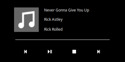
Popup layouts are fully customisableAvailable hooks:
key
default
description
backgroundNoneWidget background color
decorations[]Decorations for widgets
default_artwork'/home/docs/checkouts/readthedocs.org/user_builds/qtile-extras/checkouts/stable/qtile_extras/resources/media-icons/default.png'Image to display in popup when there’s no art
direction'default'Override the text direction in vertical bar, has no effect on text in horizontal bar.default: text displayed based on vertical bar position (left/right)ttb: text read from top to bottom, btt: text read from bottom to top.’default’, ‘ttb’, ‘btt’
display_metadata['xesam:title', 'xesam:album', 'xesam:artist'](Deprecated) Which metadata identifiers to display.
fmt'{}'Format to apply to the string returned by the widget. Main purpose: applying markup. For a widget that returns
foo, usingfmt='<i>{}</i>'would give you<i>foo</i>. To control what the widget outputs in the first place, use theformatparamater of the widget (if it has one).font'sans'Default font
fontshadowNonefont shadow color, default is None(no shadow)
fontsizeNoneFont size. Calculated if None.
foreground'ffffff'Foreground colour
format'{xesam:title} - {xesam:album} - {xesam:artist}'Format string for displaying metadata. See http://www.freedesktop.org/wiki/Specifications/mpris-spec/metadata/#index5h3 for available values. The special filed ‘{qtile:player}’ can be used to display the player name.
hide_crashFalseDon’t display error in bar if widget crashes on startup.
markupTrueWhether or not to use pango markup
max_chars0Maximum number of characters to display in widget.
mouse_callbacks{}Dict of mouse button press callback functions. Accepts functions and
lazycalls.name'audacious'Name of the MPRIS widget.
no_metadata_text'No metadata for current track'Text to show when track has no metadata
objnameNoneDBUS MPRIS 2 compatible player identifier- Find it out with dbus-monitor - Also see: http://specifications.freedesktop.org/mpris-spec/latest/#Bus-Name-Policy.
Nonewill listen for notifications from all MPRIS2 compatible players.paddingNonePadding. Calculated if None.
parse_artwork<function parse_artwork at 0x73011e8c18a0>Function to parse artwork path.
paused_text'Paused: {track}'Text to show when paused
playing_text'{track}'Text to show when playing
poll_interval0Periodic background polling interval of player (0 to disable polling).
popup_hide_timeout0Number of seconds before popup is hidden (0 to disable).
popup_layout<qtile_extras.popup.toolkit.PopupRelativeLayout object at 0x73011e8e0680>Layout for player controls.
popup_show_args{'relative_to': 2, 'relative_to_bar': True}Where to place popup
rotateTrueRotate text in vertical bar.
scrollTrueWhether text should scroll.
scroll_clearFalseWhether text should scroll completely away (True) or stop when the end of the text is shown (False)
scroll_delay2Number of seconds to pause before starting scrolling and restarting/clearing text at end
scroll_fixed_widthFalseWhen
scroll=Truethewidthparameter is a maximum width and, when text is shorter than this, the widget will resize. Settingscroll_fixed_width=Truewill force the widget to have a fixed width, regardless of the size of the text.scroll_hideFalseWhether the widget should hide when scrolling has finished
scroll_interval0.1Time in seconds before next scrolling step
scroll_repeatTrueWhether text should restart scrolling once the text has ended
scroll_step1Number of pixels to scroll with each step
separator', 'Separator for metadata fields that are a list.
stop_pause_textNone(Deprecated) Optional text to display when in the stopped/paused state
stopped_text''Text to show when stopped
- commands() list[str]
Returns a list of possible commands for this object
Used by __qsh__ for command completion and online help
- doc(name) str
Returns the documentation for a specified command name
Used by __qsh__ to provide online help.
- eval(code: str) str | None
Evaluates code in the same context as this function
Return a string representing the return value of eval, or None if exec was used instead.
- function(function, *args, **kwargs) Task | None
Call a function with current object as argument
- info()
What’s the current state of the widget?
- items(name: str) tuple[bool, list[str | int] | None]
Build a list of contained items for the given item class.
Exposing this allows __qsh__ to navigate the command graph.
Returns a tuple (root, items) for the specified item class, where:
root: True if this class accepts a “naked” specification without an item seletion (e.g. “layout” defaults to current layout), and False if it does not (e.g. no default “widget”).
items: a list of contained items
- next() None
Play the next track.
- play_pause() None
Toggle the playback status.
- previous() None
Play the previous track.
- set_font(font: str | None = None, fontsize: int = 0, fontshadow: str | tuple[int, int, int] | tuple[int, int, int, float] = '', foreground: str | tuple[int, int, int] | tuple[int, int, int, float] = '', markup: bool | None = None)
Change the text layout properties and redraw the widget. This method may also be used sync attributes from the current widget with the text layout.
- show_popup()
Method to display the popup.
- stop() None
Stop playback.
- toggle_player()
NetGraph
Note
This class has just been modified to enable compatibility with features provided by qtile-extras. No new functionality has been added.
Pong
- class qtile_extras.widget.Pong(*args, **kwargs)[source]
A completely pointless widget.
Plays a mini game of “Pong” in your bar with very, very basic AI control.
Being honest, this will probably get very distracting very quickly!
Can be used instead of a spacer widget in your bar. Options are available to have the widget be blank by default and trigger the game via commands.
Supported bar orientations: horizontal only
example config 
default key
default
description
autostartTrueGame runs as soon as the widget starts
backgroundNoneWidget background color
ball_colour'aaa'Colour of the ball
ball_max_angle45Maximum angle above/below horizontal
ball_size3Size of snake and fruit
ball_speed40Ball speed
decorations[]Decorations for widgets
hide_crashFalseDon’t display error in bar if widget crashes on startup.
loopTrueWhether a new game should start after the current one ends.
mouse_callbacks{}Dict of mouse button press callback functions. Accepts functions and
lazycalls.paddle_colour'fff'Colour of the snake.
paddle_length8Paddle length
paddle_react_distance500Paddle only moves when ball is within x pixels of the paddle
paddle_speed10Paddle speed
paddle_thickness2Paddle thickness
restart_interval2Interval between finished game and new game
- commands() list[str]
Returns a list of possible commands for this object
Used by __qsh__ for command completion and online help
- doc(name) str
Returns the documentation for a specified command name
Used by __qsh__ to provide online help.
- eval(code: str) str | None
Evaluates code in the same context as this function
Return a string representing the return value of eval, or None if exec was used instead.
- function(function, *args, **kwargs) Task | None
Call a function with current object as argument
- info()
Info for this object.
- items(name: str) tuple[bool, list[str | int] | None]
Build a list of contained items for the given item class.
Exposing this allows __qsh__ to navigate the command graph.
Returns a tuple (root, items) for the specified item class, where:
root: True if this class accepts a “naked” specification without an item seletion (e.g. “layout” defaults to current layout), and False if it does not (e.g. no default “widget”).
items: a list of contained items
- pause()
Pause the game.
- start()
Start the game.
- stop()
Stop the game and clear the screen.
PulseVolume
- class qtile_extras.widget.PulseVolume(*args, **kwargs)[source]
Same as qtile’s
PulseVolumewidget but includes the ability to select the default output sink via theselect_sink()command. This is bound to the middle-click button on the widget by default.Supported bar orientations: horizontal only
key
default
description
backgroundNoneWidget background color
decorations[]Decorations for widgets
direction'default'Override the text direction in vertical bar, has no effect on text in horizontal bar.default: text displayed based on vertical bar position (left/right)ttb: text read from top to bottom, btt: text read from bottom to top.’default’, ‘ttb’, ‘btt’
emojiFalseUse emoji to display volume states, only if
theme_pathis not set.The specified font needs to contain the correct unicode characters.emoji_list['🔇', '🔈', '🔉', '🔊']List of emojis/font-symbols to display volume states, only if
emojiis set. List contains 4 symbols, from lowest volume to highest.fmt'{}'Format to apply to the string returned by the widget. Main purpose: applying markup. For a widget that returns
foo, usingfmt='<i>{}</i>'would give you<i>foo</i>. To control what the widget outputs in the first place, use theformatparamater of the widget (if it has one).font'sans'Default font
fontshadowNonefont shadow color, default is None(no shadow)
fontsizeNoneFont size. Calculated if None.
foreground'ffffff'Foreground colour
hide_after0.5Time in seconds before hiding menu atfer mouse leave
hide_crashFalseDon’t display error in bar if widget crashes on startup.
highlight_colour'0060A0'Colour of highlight for menu items (None for no highlight)
highlight_radius5Radius for menu highlight
icon_themeNoneIcon theme for DBus menu items
limit_max_volumeFalseLimit maximum volume to 100%
markupTrueWhether or not to use pango markup
max_chars0Maximum number of characters to display in widget.
menu_background'333333'Background colour for menu
menu_border'111111'Menu border colour
menu_border_width0Width of menu border
menu_font'sans'Font for menu text
menu_fontsize12Font size for menu text
menu_foreground'ffffff'Font colour for menu text
menu_foreground_disabled'aaaaaa'Font colour for disabled menu items
menu_foreground_highlightedNoneFont colour for highlighted item (None to use menu_foreground value)
menu_icon_size12Size of icons in menu (where available)
menu_offset_x0Fine tune x position of menu
menu_offset_y0Fine tune y position of menu
menu_row_heightNoneHeight of menu row (NB text entries are 2 rows tall, separators are 1 row tall.) “None” will attempt to calculate height based on font size.
menu_width300Width of list showing available sinks.
mouse_callbacks{}Dict of mouse button press callback functions. Accepts functions and
lazycalls.mute_foregroundNoneForeground color for mute volume.
mute_format'M'Format to display when volume is muted.
opacity1Menu opacity
padding3Padding left and right. Calculated if None.
rotateTrueRotate text in vertical bar.
scrollFalseWhether text should be scrolled. When True, you must set the widget’s
width.scroll_clearFalseWhether text should scroll completely away (True) or stop when the end of the text is shown (False)
scroll_delay2Number of seconds to pause before starting scrolling and restarting/clearing text at end
scroll_fixed_widthFalseWhen
scroll=Truethewidthparameter is a maximum width and, when text is shorter than this, the widget will resize. Settingscroll_fixed_width=Truewill force the widget to have a fixed width, regardless of the size of the text.scroll_hideFalseWhether the widget should hide when scrolling has finished
scroll_interval0.1Time in seconds before next scrolling step
scroll_repeatTrueWhether text should restart scrolling once the text has ended
scroll_step1Number of pixels to scroll with each step
separator_colour'555555'Colour of menu separator
show_menu_iconsTrueShow icons in context menu
step2Volume change for up an down commands in percentage.Only used if
volume_up_commandandvolume_down_commandare not set.theme_pathNonePath of the icons
unmute_format'{volume}%'Format of text to display when volume is not muted.
- commands() list[str]
Returns a list of possible commands for this object
Used by __qsh__ for command completion and online help
- decrease_vol(value=None)
Decrease volume.
- doc(name) str
Returns the documentation for a specified command name
Used by __qsh__ to provide online help.
- eval(code: str) str | None
Evaluates code in the same context as this function
Return a string representing the return value of eval, or None if exec was used instead.
- function(function, *args, **kwargs) Task | None
Call a function with current object as argument
- increase_vol(value=None)
Increase volume.
- info()
Info for this object.
- items(name: str) tuple[bool, list[str | int] | None]
Build a list of contained items for the given item class.
Exposing this allows __qsh__ to navigate the command graph.
Returns a tuple (root, items) for the specified item class, where:
root: True if this class accepts a “naked” specification without an item seletion (e.g. “layout” defaults to current layout), and False if it does not (e.g. no default “widget”).
items: a list of contained items
- mute()
Mute the sound device.
- select_sink(x=None, y=None, centered=False, warp_pointer=False, relative_to=1, relative_to_bar=False, hide_on_timeout=None)
Select output sink from available sinks.
- set_font(font: str | None = None, fontsize: int = 0, fontshadow: str | tuple[int, int, int] | tuple[int, int, int, float] = '', foreground: str | tuple[int, int, int] | tuple[int, int, int, float] = '', markup: bool | None = None)
Change the text layout properties and redraw the widget. This method may also be used sync attributes from the current widget with the text layout.
PulseVolumeExtra
- class qtile_extras.widget.PulseVolumeExtra(*args, **kwargs)[source]
Volume widget for systems using PulseAudio.
The appearance is identical to
ALSAWidgetbut this widget uses qtile’sPulseVolumewidget to set/retrieve volume levels. As a result, you will need the pulsectl_asyncio library to use this widget.The widget allows users to select the output sink by middle clicking on the widget or calling the
select_sink()command.The widget displays volume level via an icon, bar or both. The icon is permanently visible while the bar only displays when the volume is changed and will hide after a user-defined period.
Alternatively, if you select the popup mode then no widget will appear on the bar and, instead, a small popup will be displayed.
When using
"popup"mode, the layout of the popup can be customised via the popup_layout parameter. Users should provide a _PopupLayout object. The layout should have at least one of the following controls: aPopupSlidernamed"volume"and aPopupTextcontrol named"text"as these controls will be updated whenever the volume changes. For example, the default layout for the popup is defined as follows:VOLUME_NOTIFICATION = PopupRelativeLayout( width=200, height=50, controls=[ PopupText( text="Volume:", name="text", pos_x=0.1, pos_y=0.1, height=0.2, width=0.8, v_align="middle", h_align="center", ), PopupSlider( name="volume", pos_x=0.1, pos_y=0.3, width=0.8, height=0.8, colour_below="00ffff", bar_border_size=2, bar_border_margin=1, bar_size=6, marker_size=0, end_margin=0, ), ], )
Supported bar orientations: horizontal only
‘icon’ mode
‘bar’ mode
‘both’ mode
Available hooks:
key
default
description
backgroundNoneWidget background color
bar_backgroundNoneColour of bar background.
bar_colour'00ffff'Colour of bar (NB this setting may be overridden by other widget settings).
bar_colour_high'999900'Colour of bar if high range
bar_colour_loud'990000'Colour of bar in loud range
bar_colour_mute'999999'Colour of bar if muted
bar_colour_normal'009900'Colour of bar in normal range
bar_heightNoneHeight of bar (None = full bar height).
bar_text''Text to show over bar
bar_text_fontNoneFont to use for bar text
bar_text_fontsizeNoneFontsize for bar text
bar_text_foreground'ffffff'Colour for bar text
bar_width75Width of display bar
decorations[]Decorations for widgets
device'Master'Name of ALSA device
direction'default'Override the text direction in vertical bar, has no effect on text in horizontal bar.default: text displayed based on vertical bar position (left/right)ttb: text read from top to bottom, btt: text read from bottom to top.’default’, ‘ttb’, ‘btt’
emojiFalseUse emoji to display volume states, only if
theme_pathis not set.The specified font needs to contain the correct unicode characters.emoji_list['🔇', '🔈', '🔉', '🔊']List of emojis/font-symbols to display volume states, only if
emojiis set. List contains 4 symbols, from lowest volume to highest.fmt'{}'Format to apply to the string returned by the widget. Main purpose: applying markup. For a widget that returns
foo, usingfmt='<i>{}</i>'would give you<i>foo</i>. To control what the widget outputs in the first place, use theformatparamater of the widget (if it has one).font'sans'Default font
fontshadowNonefont shadow color, default is None(no shadow)
fontsizeNoneFont size
foreground'ffffff'Font colour
hide_after0.5Time in seconds before hiding menu atfer mouse leave
hide_crashFalseDon’t display error in bar if widget crashes on startup.
hide_interval5Timeout before bar is hidden after update
highlight_colour'0060A0'Colour of highlight for menu items (None for no highlight)
highlight_radius5Radius for menu highlight
icon_sizeNoneSize of the volume icon
icon_themeNoneIcon theme for DBus menu items
limit_high90Max percentage for high range
limit_loud100Max percentage for loud range
limit_max_volumeFalseLimit maximum volume to 100%
limit_normal70Max percentage for normal range
markupTrueWhether or not to use pango markup
max_chars0Maximum number of characters to display in widget.
menu_background'333333'Background colour for menu
menu_border'111111'Menu border colour
menu_border_width0Width of menu border
menu_font'sans'Font for menu text
menu_fontsize12Font size for menu text
menu_foreground'ffffff'Font colour for menu text
menu_foreground_disabled'aaaaaa'Font colour for disabled menu items
menu_foreground_highlightedNoneFont colour for highlighted item (None to use menu_foreground value)
menu_icon_size12Size of icons in menu (where available)
menu_offset_x0Fine tune x position of menu
menu_offset_y0Fine tune y position of menu
menu_row_heightNoneHeight of menu row (NB text entries are 2 rows tall, separators are 1 row tall.) “None” will attempt to calculate height based on font size.
menu_width300Width of list showing available sinks.
mode'bar'Display mode: ‘icon’, ‘bar’, ‘both’, ‘popup’.
mouse_callbacks{}Dict of mouse button press callback functions. Accepts functions and
lazycalls.mute_foregroundNoneForeground color for mute volume.
mute_format'M'Format to display when volume is muted.
opacity1Menu opacity
padding0Padding before icon
popup_hide_timeout5Time before popup hides
popup_layout<qtile_extras.popup.toolkit.PopupRelativeLayout object at 0x73011f268c50>Layout for popup mode
popup_show_args{'relative_to': 2, 'relative_to_bar': True, 'y': 50}Control position of popup
rotateTrueRotate text in vertical bar.
scrollFalseWhether text should be scrolled. When True, you must set the widget’s
width.scroll_clearFalseWhether text should scroll completely away (True) or stop when the end of the text is shown (False)
scroll_delay2Number of seconds to pause before starting scrolling and restarting/clearing text at end
scroll_fixed_widthFalseWhen
scroll=Truethewidthparameter is a maximum width and, when text is shorter than this, the widget will resize. Settingscroll_fixed_width=Truewill force the widget to have a fixed width, regardless of the size of the text.scroll_hideFalseWhether the widget should hide when scrolling has finished
scroll_interval0.1Time in seconds before next scrolling step
scroll_repeatTrueWhether text should restart scrolling once the text has ended
scroll_step1Number of pixels to scroll with each step
separator_colour'555555'Colour of menu separator
show_menu_iconsTrueShow icons in context menu
step5Amount to increase volume by
text_format'{volume}%'String format
theme_pathNonePath to theme icons.
unmute_format'{volume}%'Format of text to display when volume is not muted.
update_interval5Interval to update widget (e.g. if changes made in other apps).
- commands() list[str]
Returns a list of possible commands for this object
Used by __qsh__ for command completion and online help
- decrease_vol(value=None)
Decrease volume.
- doc(name) str
Returns the documentation for a specified command name
Used by __qsh__ to provide online help.
- eval(code: str) str | None
Evaluates code in the same context as this function
Return a string representing the return value of eval, or None if exec was used instead.
- function(function, *args, **kwargs) Task | None
Call a function with current object as argument
- increase_vol(value=None)
Increase volume.
- info()
Info for this object.
- items(name: str) tuple[bool, list[str | int] | None]
Build a list of contained items for the given item class.
Exposing this allows __qsh__ to navigate the command graph.
Returns a tuple (root, items) for the specified item class, where:
root: True if this class accepts a “naked” specification without an item seletion (e.g. “layout” defaults to current layout), and False if it does not (e.g. no default “widget”).
items: a list of contained items
- mute()
Mute the sound device.
- select_sink(x=None, y=None, centered=False, warp_pointer=False, relative_to=1, relative_to_bar=False, hide_on_timeout=None)
Select output sink from available sinks.
- set_font(font: str | None = None, fontsize: int = 0, fontshadow: str | tuple[int, int, int] | tuple[int, int, int, float] = '', foreground: str | tuple[int, int, int] | tuple[int, int, int, float] = '', markup: bool | None = None)
Change the text layout properties and redraw the widget. This method may also be used sync attributes from the current widget with the text layout.
- show_popup()
Method to display the popup.
- toggle_mute(*args, **kwargs)
Mute audio output
- volume_down(value=None)
Decrease volume.
- volume_up(value=None)
Increase volume.
QTEMirror
Note
This class has just been modified to enable compatibility with features provided by qtile-extras. No new functionality has been added.
- class qtile_extras.widget.QTEMirror(*args, **kwargs)[source]
A modified version of Qtile’s Mirror widget.
The only difference is to ensure mirrored widgets are sized correctly.
..important:
The mirror will also reflect any decorations of the original widget. Therefore,
if you need different decoration behaviour, you must create a new instance of the
widget.
This widget should not be created directly by users.
ScriptExit
- class qtile_extras.widget.ScriptExit(*args, **kwargs)[source]
An updated version of Qtile’s QuickExit widget.
Takes an additional argument
exit_scriptwhich will be run before qtile exits.Supported bar orientations: horizontal and vertical
key
default
description
backgroundNoneWidget background color
countdown_format'[ {} seconds ]'The text displayed when counting down.
countdown_start5The number to count down from.
decorations[]Decorations for widgets
default_text'[ shutdown ]'The text displayed on the button.
direction'default'Override the text direction in vertical bar, has no effect on text in horizontal bar.default: text displayed based on vertical bar position (left/right)ttb: text read from top to bottom, btt: text read from bottom to top.’default’, ‘ttb’, ‘btt’
exit_script''Script to run on exit.
fmt'{}'Format to apply to the string returned by the widget. Main purpose: applying markup. For a widget that returns
foo, usingfmt='<i>{}</i>'would give you<i>foo</i>. To control what the widget outputs in the first place, use theformatparamater of the widget (if it has one).font'sans'Default font
fontshadowNonefont shadow color, default is None(no shadow)
fontsizeNoneFont size. Calculated if None.
foreground'ffffff'Foreground colour
hide_crashFalseDon’t display error in bar if widget crashes on startup.
markupTrueWhether or not to use pango markup
max_chars0Maximum number of characters to display in widget.
mouse_callbacks{}Dict of mouse button press callback functions. Accepts functions and
lazycalls.paddingNonePadding. Calculated if None.
rotateTrueRotate text in vertical bar.
scrollFalseWhether text should be scrolled. When True, you must set the widget’s
width.scroll_clearFalseWhether text should scroll completely away (True) or stop when the end of the text is shown (False)
scroll_delay2Number of seconds to pause before starting scrolling and restarting/clearing text at end
scroll_fixed_widthFalseWhen
scroll=Truethewidthparameter is a maximum width and, when text is shorter than this, the widget will resize. Settingscroll_fixed_width=Truewill force the widget to have a fixed width, regardless of the size of the text.scroll_hideFalseWhether the widget should hide when scrolling has finished
scroll_interval0.1Time in seconds before next scrolling step
scroll_repeatTrueWhether text should restart scrolling once the text has ended
scroll_step1Number of pixels to scroll with each step
timer_interval1The countdown interval.
- commands() list[str]
Returns a list of possible commands for this object
Used by __qsh__ for command completion and online help
- doc(name) str
Returns the documentation for a specified command name
Used by __qsh__ to provide online help.
- eval(code: str) str | None
Evaluates code in the same context as this function
Return a string representing the return value of eval, or None if exec was used instead.
- function(function, *args, **kwargs) Task | None
Call a function with current object as argument
- info()
Info for this object.
- items(name: str) tuple[bool, list[str | int] | None]
Build a list of contained items for the given item class.
Exposing this allows __qsh__ to navigate the command graph.
Returns a tuple (root, items) for the specified item class, where:
root: True if this class accepts a “naked” specification without an item seletion (e.g. “layout” defaults to current layout), and False if it does not (e.g. no default “widget”).
items: a list of contained items
- set_font(font: str | None = None, fontsize: int = 0, fontshadow: str | tuple[int, int, int] | tuple[int, int, int, float] = '', foreground: str | tuple[int, int, int] | tuple[int, int, int, float] = '', markup: bool | None = None)
Change the text layout properties and redraw the widget. This method may also be used sync attributes from the current widget with the text layout.
- trigger()
Snake
- class qtile_extras.widget.Snake(*args, **kwargs)[source]
A completely pointless widget.
Plays a mini game of “Snake” in your bar with very, very basic AI control.
Being honest, this will probably get very distracting very quickly!
Can be used instead of a spacer widget in your bar. Options are available to have the widget be blank by default and trigger the game via commands.
Supported bar orientations: horizontal and vertical
example config 
default 
snake_colour='f0f', fruit_colour=['0ff'], size=4
autostart=Falsekey
default
description
autostartTrueGame runs as soon as the widget starts
backgroundNoneWidget background color
decorations[]Decorations for widgets
fruit_colour['A00', 'A40', 'AA0', '09A', '00A']List of possible colours of the fruit
hide_crashFalseDon’t display error in bar if widget crashes on startup.
interval0.04Interval between each step
loopTrueWhether a new game should start after the current one ends.
mouse_callbacks{}Dict of mouse button press callback functions. Accepts functions and
lazycalls.restart_interval2Interval between finished game and new game
size3Size of snake and fruit
snake_colour'090'Colour of the snake.
- commands() list[str]
Returns a list of possible commands for this object
Used by __qsh__ for command completion and online help
- doc(name) str
Returns the documentation for a specified command name
Used by __qsh__ to provide online help.
- eval(code: str) str | None
Evaluates code in the same context as this function
Return a string representing the return value of eval, or None if exec was used instead.
- function(function, *args, **kwargs) Task | None
Call a function with current object as argument
- info()
Info for this object.
- items(name: str) tuple[bool, list[str | int] | None]
Build a list of contained items for the given item class.
Exposing this allows __qsh__ to navigate the command graph.
Returns a tuple (root, items) for the specified item class, where:
root: True if this class accepts a “naked” specification without an item seletion (e.g. “layout” defaults to current layout), and False if it does not (e.g. no default “widget”).
items: a list of contained items
- pause()
Pause the game.
- start()
Start the game.
- stop()
Stop the game and clear the screen.
SnapCast
- class qtile_extras.widget.SnapCast(*args, **kwargs)[source]
A widget to run a snapclient instance in the background.
Stream metadata can be displayed via the
Mpris2widget ifenable_mpris2is set toTrue. Playback control may also be available if supported by the current stream.Right-clicking on the widget will toggle the player while left-clicking will open a menu to provide additional control. Users can move the client between groups and change the group’s stream.
Required Dependencies
This module requires the following third-party libraries:
requests,websocketsSupported bar orientations: horizontal only
example config 
default key
default
description
active_colour'ffffff'Colour when client is active and connected to server
backgroundNoneWidget background color
client_idNoneClient id (if blank, will use MAC address).
decorations[]Decorations for widgets
enable_mpris2FalseBroadcast metadata on Mpris2 interface
error_colour'ffff00'Colour when client has an error (check logs)
hide_after0.5Time in seconds before hiding menu atfer mouse leave
hide_crashFalseDon’t display error in bar if widget crashes on startup.
highlight_colour'0060A0'Colour of highlight for menu items (None for no highlight)
highlight_radius5Radius for menu highlight
icon_sizeNoneIcon size. None = autofit.
icon_themeNoneIcon theme for DBus menu items
inactive_colour'999999'Colour when client is inactive
menu_background'333333'Background colour for menu
menu_border'111111'Menu border colour
menu_border_width0Width of menu border
menu_font'sans'Font for menu text
menu_fontsize12Font size for menu text
menu_foreground'ffffff'Font colour for menu text
menu_foreground_disabled'aaaaaa'Font colour for disabled menu items
menu_foreground_highlightedNoneFont colour for highlighted item (None to use menu_foreground value)
menu_icon_size12Size of icons in menu (where available)
menu_offset_x0Fine tune x position of menu
menu_offset_y0Fine tune y position of menu
menu_row_heightNoneHeight of menu row (NB text entries are 2 rows tall, separators are 1 row tall.) “None” will attempt to calculate height based on font size.
menu_width200Context menu width
mouse_callbacks{}Dict of mouse button press callback functions. Accepts functions and
lazycalls.opacity1Menu opacity
options''Options to be passed to snapclient.
padding2Padding around icon (and text).
separator_colour'555555'Colour of menu separator
server_address'localhost'Name or IP address of server.
server_port1705Port the snapserver is running on
server_reconnect_interval15Interval before retrying to find player on server after failed attempt
show_menu_iconsTrueShow icons in context menu
snapclient'/usr/bin/snapclient'Path to snapclient
- commands() list[str]
Returns a list of possible commands for this object
Used by __qsh__ for command completion and online help
- doc(name) str
Returns the documentation for a specified command name
Used by __qsh__ to provide online help.
- eval(code: str) str | None
Evaluates code in the same context as this function
Return a string representing the return value of eval, or None if exec was used instead.
- function(function, *args, **kwargs) Task | None
Call a function with current object as argument
- info()
Info for this object.
- items(name: str) tuple[bool, list[str | int] | None]
Build a list of contained items for the given item class.
Exposing this allows __qsh__ to navigate the command graph.
Returns a tuple (root, items) for the specified item class, where:
root: True if this class accepts a “naked” specification without an item seletion (e.g. “layout” defaults to current layout), and False if it does not (e.g. no default “widget”).
items: a list of contained items
- show_stream_options(x=None, y=None, centered=False, warp_pointer=False, relative_to=1, relative_to_bar=False, hide_on_timeout=None)
Show a menu to change group/stream.
- stop()
- toggle_state()
Toggle Snapcast on and off.
StatusNotifier
- class qtile_extras.widget.StatusNotifier(*args, **kwargs)[source]
A modified version of the default Qtile StatusNotifier widget.
Added the ability to render context menus by right-clicking on the icon.
Required Dependencies
This module requires the following third-party libraries:
dbus-fast,xdgSupported bar orientations: horizontal and vertical

Widget showing Remmina icon and context menu.
example config 
For some reason the docs won't display the icon...
...but the menu works.key
default
description
backgroundNoneWidget background color
decorations[]Decorations for widgets
foreground'fff'Colour for masked icons
hide_after0.5Time in seconds before hiding menu atfer mouse leave
hide_crashFalseDon’t display error in bar if widget crashes on startup.
highlight_colour'0060A0'Colour of highlight for menu items (None for no highlight)
highlight_radius5Radius for menu highlight
icon_size16Icon width
icon_themeNoneName of theme to use for app icons
maskFalseUse icon as mask. Use ‘foreground’ to set icon colour.
menu_background'333333'Background colour for menu
menu_border'111111'Menu border colour
menu_border_width0Width of menu border
menu_font'sans'Font for menu text
menu_fontsize12Font size for menu text
menu_foreground'ffffff'Font colour for menu text
menu_foreground_disabled'aaaaaa'Font colour for disabled menu items
menu_foreground_highlightedNoneFont colour for highlighted item (None to use menu_foreground value)
menu_icon_size12Size of icons in menu (where available)
menu_offset_x0Fine tune x position of menu
menu_offset_y0Fine tune y position of menu
menu_row_heightNoneHeight of menu row (NB text entries are 2 rows tall, separators are 1 row tall.) “None” will attempt to calculate height based on font size.
menu_width200Context menu width
mouse_callbacks{}Dict of mouse button press callback functions. Accepts functions and
lazycalls.opacity1Menu opacity
padding3Padding between icons
separator_colour'555555'Colour of menu separator
show_menu_iconsTrueShow icons in context menu
- commands() list[str]
Returns a list of possible commands for this object
Used by __qsh__ for command completion and online help
- doc(name) str
Returns the documentation for a specified command name
Used by __qsh__ to provide online help.
- eval(code: str) str | None
Evaluates code in the same context as this function
Return a string representing the return value of eval, or None if exec was used instead.
- function(function, *args, **kwargs) Task | None
Call a function with current object as argument
- info()
Info for this object.
- items(name: str) tuple[bool, list[str | int] | None]
Build a list of contained items for the given item class.
Exposing this allows __qsh__ to navigate the command graph.
Returns a tuple (root, items) for the specified item class, where:
root: True if this class accepts a “naked” specification without an item seletion (e.g. “layout” defaults to current layout), and False if it does not (e.g. no default “widget”).
items: a list of contained items
StravaWidget
Warning
This class has been marked as experimental.
The widget may behave unexpectedly, have missing features and will probably crash at some point!
Feedback on any issues would be appreciated.
- class qtile_extras.widget.StravaWidget(*args, **kwargs)[source]
This module provides a simple widget showing some Strava stats.
The widget text can be customised using the following keys:
prefix
suffix
value
C
Current month
Y
Calendar year
A
All time
D
Distance
C
Count
T
Time
P
Pace
N
Name
A
Date
For example, the default text
{CA:%b} {CD:.1f}kmdisplays the current date in abbreviated month name format and the distance run that month: “Aug 143.1km”.Extended info is provided by clicking on the widget.
Note
You will need to follow the instuctions at https://developers.strava.com/ to create a new app and authorise it.
Your id and secret should be put in a json file called
auth.jsonin~/.cache/stravawidgetThe token file generated by the authorisation process, strava.json, should also be placed in the same folder.
Required Dependencies
This module requires the following third-party libraries:
stravalib,pintSupported bar orientations: horizontal only

Extended info. I’ve blurred out details of my runs for privacy reasons.
key
default
description
backgroundNoneWidget background color
decorations[]Decorations for widgets
font'sans'Default font
fontsizeNoneFont size
foreground'ffffff'Text colour
hide_crashFalseDon’t display error in bar if widget crashes on startup.
margin3Margin inside the box
margin_xNoneX Margin. Overrides ‘margin’ if set
margin_yNoneY Margin. Overrides ‘margin’ if set
mouse_callbacks{}Dict of mouse button press callback functions. Accepts functions and
lazycalls.popup_display_timeout15Time to display extended info
refresh_interval1800Time to update data
startup_delay10Time before sending first web request
text'{CA:%b} {CD:.1f}km'Widget text
warning_colour'aaaa00'Highlight when there is an error.
- commands() list[str]
Returns a list of possible commands for this object
Used by __qsh__ for command completion and online help
- doc(name) str
Returns the documentation for a specified command name
Used by __qsh__ to provide online help.
- eval(code: str) str | None
Evaluates code in the same context as this function
Return a string representing the return value of eval, or None if exec was used instead.
- function(function, *args, **kwargs) Task | None
Call a function with current object as argument
- items(name: str) tuple[bool, list[str | int] | None]
Build a list of contained items for the given item class.
Exposing this allows __qsh__ to navigate the command graph.
Returns a tuple (root, items) for the specified item class, where:
root: True if this class accepts a “naked” specification without an item seletion (e.g. “layout” defaults to current layout), and False if it does not (e.g. no default “widget”).
items: a list of contained items


SwapGraph
Note
This class has just been modified to enable compatibility with features provided by qtile-extras. No new functionality has been added.
Syncthing
- class qtile_extras.widget.Syncthing(*args, **kwargs)[source]
A widget to show the sync status of a Syncthing server.
By default, the widget displays an icon in the bar which is grey when no syncing is occurring but changes to white when syncing starts.
The widget can be configured to monitor a specific device or folder. By default, it monitors the local device at the
serveraddress.Note: there is no verification of SSL certificates when connecting to the host. If this is a problem for you, please start an issue on the github page.
Required Dependencies
This module requires the following third-party libraries:
requestsSupported bar orientations: horizontal only
Available hooks:
key
default
description
api_keyNoneAPI key for the Syncthing server instance.
backgroundNoneWidget background color
bar_backgroundNoneColour of bar background.
bar_colour'008888'Bar colour.
bar_height10Height of sync progress bar.
bar_text''Text to show over bar
bar_text_fontNoneFont to use for bar text
bar_text_fontsizeNoneFontsize for bar text
bar_text_foreground'ffffff'Colour for bar text
bar_text_format'{percentage:.0%}'Format string to display text on progress bar.
bar_width75Width of bar.
decorations[]Decorations for widgets
filter{}Limit the status check to a specific folder or device. Takes a dictionary where the key is either ‘folder’ or ‘device’ and the value is the appropriate ID. An empty ‘folder’ will aggregate all folders. An empty ‘device’ will use the local device. Default (empty dictionary) aggregates all folders on local device.
hide_crashFalseDon’t display error in bar if widget crashes on startup.
hide_on_idleTrueHide widget if no sync in progress.
icon_colour_error'ffff00'Colour for Syncthing logo when there’s an error.
icon_colour_idle'999999'Colour for Syncthing logo when idle.
icon_colour_sync'ffffff'Colour for Syncthing logo when syncing.
icon_sizeNoneIcon size. None = autofit.
mouse_callbacks{}Dict of mouse button press callback functions. Accepts functions and
lazycalls.padding2Padding around icon.
server'http://localhost:8384'Syncthing API server.
show_barFalseShow progress bar when syncing.
show_iconTrueShow icon.
update_interval5Time before updating status.
update_interval_syncing1Time before updating while syncing.
- commands() list[str]
Returns a list of possible commands for this object
Used by __qsh__ for command completion and online help
- doc(name) str
Returns the documentation for a specified command name
Used by __qsh__ to provide online help.
- eval(code: str) str | None
Evaluates code in the same context as this function
Return a string representing the return value of eval, or None if exec was used instead.
- function(function, *args, **kwargs) Task | None
Call a function with current object as argument
- info()
Info for this object.
- items(name: str) tuple[bool, list[str | int] | None]
Build a list of contained items for the given item class.
Exposing this allows __qsh__ to navigate the command graph.
Returns a tuple (root, items) for the specified item class, where:
root: True if this class accepts a “naked” specification without an item seletion (e.g. “layout” defaults to current layout), and False if it does not (e.g. no default “widget”).
items: a list of contained items
Systray
Note
This class has just been modified to enable compatibility with features provided by qtile-extras. No new functionality has been added.
- class qtile_extras.widget.Systray(*args, **kwargs)[source]
A modified version of Qtile’s Systray widget.
The only difference is to improve behaviour of the icon background when using
RectDecorationdecorations.This widget does not and will not fix the issue with icons having a transparent background when displaying on a (semi-)transparent bar.
TVHWidget
- class qtile_extras.widget.TVHWidget(*args, **kwargs)[source]
A widget to show whether a TVHeadend server is currently recording or not.
The widget will also show a popup displaying upcoming recordings.
When the server is recording a red line will be shown under the icon. If there’s an error, a yellow line will show above the icon (and check the logs).
NB if you use a username and password, these are stored in plain text. You may therefore wish to create an unprivileged user account in TVHeadend that only has access to scheduled recordings data.
Required Dependencies
This module requires the following third-party libraries:
requestsSupported bar orientations: horizontal only
example config 
Not recording.
Recording.
Popup shows upcoming recordingsAvailable hooks:
key
default
description
authNoneAuth details for accessing tvh. Can be None, tuple of (username, password).
auth_type'basic'HTTP authentication type: ‘digest’ or ‘basic’
backgroundNoneWidget background color
decorations[]Decorations for widgets
hide_crashFalseDon’t display error in bar if widget crashes on startup.
hide_duplicatesTrueRemove duplicate recordings from list of upcoming recordings.
host'http://localhost:9981/api'TVHeadend server address
margin3Margin inside the box
margin_xNoneX Margin. Overrides ‘margin’ if set
margin_yNoneY Margin. Overrides ‘margin’ if set
mouse_callbacks{}Dict of mouse button press callback functions. Accepts functions and
lazycalls.popup_display_timeout10Seconds to show recordings.
popup_font'monospace'Font to use for displaying upcoming recordings. A monospace font is recommended
popup_format'{start:%a %d %b %H:%M}: {title:.40}'Upcoming recording text.
popup_opacity0.8Opacity for popup window.
popup_padding10Padding for popup window.
recording_colour'bb0000'Highlight when TVHeadend is recording
refresh_interval30Time to update data
startup_delay5Time before sending first web request
tvh_timeout5Seconds before timeout for timeout request
upcoming_recordings_path'/dvr/entry/grid_upcoming'API point for retrieving data on upcoming recordings.
warning_colour'aaaa00'Highlight when there is an error.
- commands() list[str]
Returns a list of possible commands for this object
Used by __qsh__ for command completion and online help
- doc(name) str
Returns the documentation for a specified command name
Used by __qsh__ to provide online help.
- eval(code: str) str | None
Evaluates code in the same context as this function
Return a string representing the return value of eval, or None if exec was used instead.
- function(function, *args, **kwargs) Task | None
Call a function with current object as argument
- items(name: str) tuple[bool, list[str | int] | None]
Build a list of contained items for the given item class.
Exposing this allows __qsh__ to navigate the command graph.
Returns a tuple (root, items) for the specified item class, where:
root: True if this class accepts a “naked” specification without an item seletion (e.g. “layout” defaults to current layout), and False if it does not (e.g. no default “widget”).
items: a list of contained items
Tetris
- class qtile_extras.widget.Tetris(*args, **kwargs)[source]
A completely pointless widget.
Plays a mini game of “Tetris” in your bar with very, very basic AI control.
There is no user control and this is just a little tribute to the original game that will, hopefully, bring a smile to your face. Howver, being honest, this will probably just get very distracting very quickly!
The AI can be adjusted to tune the behaviour of how it decides where to place a shape. It looks at possible positions and scores them based on the following formula:
(number of holes beneath blocks * weight_holes)
- (row number of placed block * weight_row)
- (number of rows to be completed * weight_completion)
The option with the lowest score is selected,
Can be used instead of a spacer widget in your bar. Options are available to have the widget be blank by default and trigger the game via commands.
Supported bar orientations: horizontal and vertical
example config 
default 
blockify=True
cell_size=3key
default
description
autostartTrueGame runs as soon as the widget starts
backgroundNoneWidget background color
blockifyFalseShow gaps between blocks. Best with cell size >= 5 as this reduces size of blocks.
cell_size5decorations[]Decorations for widgets
gap_size1Size of ‘blockify’ gap.
hide_crashFalseDon’t display error in bar if widget crashes on startup.
loopTrueWhether a new game should start after the current one ends.
mouse_callbacks{}Dict of mouse button press callback functions. Accepts functions and
lazycalls.restart_interval2Interval between finished game and new game
speed10Maximum angle above/below horizontal
weight_completion500Weighting for completing rows
weight_holes1000Weighting for holes created beneath piece
weight_row400Weighting for row that shape is placed in.
- commands() list[str]
Returns a list of possible commands for this object
Used by __qsh__ for command completion and online help
- doc(name) str
Returns the documentation for a specified command name
Used by __qsh__ to provide online help.
- eval(code: str) str | None
Evaluates code in the same context as this function
Return a string representing the return value of eval, or None if exec was used instead.
- function(function, *args, **kwargs) Task | None
Call a function with current object as argument
- info()
Info for this object.
- items(name: str) tuple[bool, list[str | int] | None]
Build a list of contained items for the given item class.
Exposing this allows __qsh__ to navigate the command graph.
Returns a tuple (root, items) for the specified item class, where:
root: True if this class accepts a “naked” specification without an item seletion (e.g. “layout” defaults to current layout), and False if it does not (e.g. no default “widget”).
items: a list of contained items
- pause()
Pause game.
- start()
Start game.
- stop()
Stop game.
- toggle_blocks()
Toggles gaps between blocks.
UPowerWidget
- class qtile_extras.widget.UPowerWidget(*args, **kwargs)[source]
A graphical widget to display laptop battery level.
The widget uses dbus to read the battery information from the UPower interface.
The widget will display one icon for each battery found or users can specify the name of the battery if they only wish to display one.
Clicking on the widget will display the battery level and the time to empty/full.
All colours can be customised as well as low/critical percentage levels.
Required Dependencies
This module requires the following third-party libraries:
dbus-fastSupported bar orientations: horizontal only
Normal

Low

Critical
Charging

Multiple batteries

Showing text
Available hooks:
key
default
description
backgroundNoneWidget background color
battery_height10Height of battery icon
battery_nameNoneBattery name. None = all batteries
battery_width20Size of battery icon
border_charge_colour'8888ff'Border colour when charging.
border_colour'dbdbe0'Border colour when discharging.
border_critical_colour'cc0000'Border colour when battery low.
decorations[]Decorations for widgets
fill_chargeNoneOverride fill colour when charging
fill_critical'cc0000'Fill when critically low
fill_low'aa00aa'Fill colour when battery low
fill_normal'dbdbe0'Fill when normal
font'sans'Default font
fontsizeNoneFont size
foreground'ffffff'Font colour for information text
hide_crashFalseDon’t display error in bar if widget crashes on startup.
margin2Margin on sides of widget
mouse_callbacks{}Dict of mouse button press callback functions. Accepts functions and
lazycalls.percentage_critical0.1Critical level threshold.
percentage_low0.2Low level threshold.
spacing5Space between batteries
text_charging'({percentage:.0f}%) {ttf} until fully charged'Text to display when charging.
text_discharging'({percentage:.0f}%) {tte} until empty'Text to display when on battery.
text_displaytime5Time for text to remain before hiding
- commands() list[str]
Returns a list of possible commands for this object
Used by __qsh__ for command completion and online help
- doc(name) str
Returns the documentation for a specified command name
Used by __qsh__ to provide online help.
- eval(code: str) str | None
Evaluates code in the same context as this function
Return a string representing the return value of eval, or None if exec was used instead.
- function(function, *args, **kwargs) Task | None
Call a function with current object as argument
- items(name: str) tuple[bool, list[str | int] | None]
Build a list of contained items for the given item class.
Exposing this allows __qsh__ to navigate the command graph.
Returns a tuple (root, items) for the specified item class, where:
root: True if this class accepts a “naked” specification without an item seletion (e.g. “layout” defaults to current layout), and False if it does not (e.g. no default “widget”).
items: a list of contained items

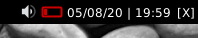

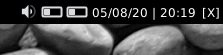

UnitStatus
- class qtile_extras.widget.UnitStatus(*args, **kwargs)[source]
UnitStatus is a basic widget for Qtile which shows the current status of systemd units.
It may not be particular useful for you and was primarily written as an exercise to familiarise myself with writing Qtile widgets and interacting with d-bus.
The widget is incredibly basic. It subscribes to the systemd d-bus interface, finds the relevant service and displays an icon based on the current status. The widget listens for announced changes to the service and updates the icon accordingly.
Required Dependencies
This module requires the following third-party libraries:
dbus-fastSupported bar orientations: horizontal only

key
default
description
backgroundNoneWidget background color
bus_name'system'Which bus to use. Accepts ‘system’ or ‘session’.
colour_active'00ff00'Colour for active indicator
colour_dead'666666'Colour for dead indicator
colour_failed'ff0000'Colour for failed indicator
colour_inactive'ffffff'Colour for inactive indicator
decorations[]Decorations for widgets
font'sans'Default font
fontsizeNoneFont size
foreground'ffffff'Font colour
hide_crashFalseDon’t display error in bar if widget crashes on startup.
indicator_size10Size of indicator (None = up to margin)
label'NM'Short text to display next to indicator.
margin3Margin inside the box
margin_xNoneX Margin. Overrides ‘margin’ if set
margin_yNoneY Margin. Overrides ‘margin’ if set
mouse_callbacks{}Dict of mouse button press callback functions. Accepts functions and
lazycalls.padding3Padding inside the box
padding_xNoneX Padding. Overrides ‘padding’ if set
padding_yNoneY Padding. Overrides ‘padding’ if set
state_map{'activating': ('colour_active', 'colour_inactive'), 'active': ('colour_active', 'colour_active'), 'deactivating': ('colour_inactive', 'colour_active'), 'dead': ('colour_dead', 'colour_dead'), 'failed': ('colour_failed', 'colour_failed'), 'inactive': ('colour_inactive', 'colour_inactive'), 'not-found': ('colour_inactive', 'colour_failed')}Map of indicator colours (border, fill)
unitname'NetworkManager.service'Name of systemd unit.
- commands() list[str]
Returns a list of possible commands for this object
Used by __qsh__ for command completion and online help
- doc(name) str
Returns the documentation for a specified command name
Used by __qsh__ to provide online help.
- eval(code: str) str | None
Evaluates code in the same context as this function
Return a string representing the return value of eval, or None if exec was used instead.
- function(function, *args, **kwargs) Task | None
Call a function with current object as argument
- items(name: str) tuple[bool, list[str | int] | None]
Build a list of contained items for the given item class.
Exposing this allows __qsh__ to navigate the command graph.
Returns a tuple (root, items) for the specified item class, where:
root: True if this class accepts a “naked” specification without an item seletion (e.g. “layout” defaults to current layout), and False if it does not (e.g. no default “widget”).
items: a list of contained items
Visualiser
Warning
This class has been marked as experimental.
The widget may behave unexpectedly, have missing features and will probably crash at some point!
Feedback on any issues would be appreciated.
- class qtile_extras.widget.Visualiser(*args, **kwargs)[source]
A widget to draw an audio visualiser in your bar.
The widget requires cava to be installed. This may also be packaged by your distro.
cava is configured through the widget. Currently, you can set the number of bars and the framerate.
Warning
Rendering the visualiser directly in qtile’s bar is almost certainly not an efficient way to have a visualiser in your setup. You should therefore be aware that this widget uses more processing power than other widgets so you may see CPU usage increase when using this. However, if the CPU usage continues to increase the longer you use the widget then that is likely to be a bug and should be reported!
Supported bar orientations: horizontal only

Default config.
key
default
description
autostartTrueStart visualiser automatically
backgroundNoneWidget background color
bar_colour'#ffffff'Colour of visualiser bars
bar_height20Height of visualiser bars
bars8Number of bars
cava_pathNonePath to cava. Set if file is not in your PATH.
cava_pipe'/tmp/cava.pipe'Pipe for cava’s output
channels'mono'Visual channels. ‘mono’ or ‘stereo’.
decorations[]Decorations for widgets
framerate25Cava sampling rate.
hideTrueHide the visualiser when not active
hide_crashFalseDon’t display error in bar if widget crashes on startup.
invertFalseWhen True, bars will draw from the top down
mouse_callbacks{}Dict of mouse button press callback functions. Accepts functions and
lazycalls.spacing2Space between bars
width100Widget width
- commands() list[str]
Returns a list of possible commands for this object
Used by __qsh__ for command completion and online help
- doc(name) str
Returns the documentation for a specified command name
Used by __qsh__ to provide online help.
- eval(code: str) str | None
Evaluates code in the same context as this function
Return a string representing the return value of eval, or None if exec was used instead.
- function(function, *args, **kwargs) Task | None
Call a function with current object as argument
- info()
Info for this object.
- items(name: str) tuple[bool, list[str | int] | None]
Build a list of contained items for the given item class.
Exposing this allows __qsh__ to navigate the command graph.
Returns a tuple (root, items) for the specified item class, where:
root: True if this class accepts a “naked” specification without an item seletion (e.g. “layout” defaults to current layout), and False if it does not (e.g. no default “widget”).
items: a list of contained items
- start()
Start the visualiser.
- stop()
Stop this visualiser.
- toggle()
Toggle visualiser state.

Visualizer
Warning
This class has been marked as experimental.
The widget may behave unexpectedly, have missing features and will probably crash at some point!
Feedback on any issues would be appreciated.
- qtile_extras.widget.Visualizer[source]
Supported bar orientations: horizontal only
Default config.
key
default
description
autostartTrueStart visualiser automatically
backgroundNoneWidget background color
bar_colour'#ffffff'Colour of visualiser bars
bar_height20Height of visualiser bars
bars8Number of bars
cava_pathNonePath to cava. Set if file is not in your PATH.
cava_pipe'/tmp/cava.pipe'Pipe for cava’s output
channels'mono'Visual channels. ‘mono’ or ‘stereo’.
decorations[]Decorations for widgets
framerate25Cava sampling rate.
hideTrueHide the visualiser when not active
hide_crashFalseDon’t display error in bar if widget crashes on startup.
invertFalseWhen True, bars will draw from the top down
mouse_callbacks{}Dict of mouse button press callback functions. Accepts functions and
lazycalls.spacing2Space between bars
width100Widget width
- Visualizer.commands() list[str]
Returns a list of possible commands for this object
Used by __qsh__ for command completion and online help
- Visualizer.doc(name) str
Returns the documentation for a specified command name
Used by __qsh__ to provide online help.
- Visualizer.eval(code: str) str | None
Evaluates code in the same context as this function
Return a string representing the return value of eval, or None if exec was used instead.
- Visualizer.function(function, *args, **kwargs) Task | None
Call a function with current object as argument
- Visualizer.info()
Info for this object.
- Visualizer.items(name: str) tuple[bool, list[str | int] | None]
Build a list of contained items for the given item class.
Exposing this allows __qsh__ to navigate the command graph.
Returns a tuple (root, items) for the specified item class, where:
root: True if this class accepts a “naked” specification without an item seletion (e.g. “layout” defaults to current layout), and False if it does not (e.g. no default “widget”).
items: a list of contained items
- Visualizer.start()
Start the visualiser.
- Visualizer.stop()
Stop this visualiser.
- Visualizer.toggle()
Toggle visualiser state.
alias of
Visualiser
WiFiIcon
- class qtile_extras.widget.WiFiIcon(*args, **kwargs)[source]
An simple graphical widget that shows WiFi status.
Left-clicking the widget will show the name of the network.
The widget can also periodically poll an external IP address to check whether the device is connected to the internet. To enable this, you need to set the check_connection_interval.
Required Dependencies
This module requires the following third-party libraries:
iwlibSupported bar orientations: horizontal only


Additional detail is visible when clicking on icon
key
default
description
active_colour'ffffff'Colour for wifi strength.
backgroundNoneWidget background color
check_connection_interval0Interval to check if device connected to internet (0 to disable)
decorations[]Decorations for widgets
disconnected_colour'aa0000'Colour when device has no internet connection
expanded_timeout5Time in secs for expanded information to display when clicking on icon.
font'sans'Default font
fontsizeNoneFont size
foreground'ffffff'Font colour for information text
hide_crashFalseDon’t display error in bar if widget crashes on startup.
inactive_colour'666666'Colour for wifi background.
interface'wlan0'Name of wifi interface.
internet_check_host'8.8.8.8'IP adddress to check for internet connection
internet_check_port53Port to check for internet connection
internet_check_timeout5Period before internet check times out and widget reports no internet connection.
mouse_callbacks{}Dict of mouse button press callback functions. Accepts functions and
lazycalls.padding3Padding inside the box
padding_xNoneX Padding. Overrides ‘padding’ if set
padding_yNoneY Padding. Overrides ‘padding’ if set
show_ssidFalseShow SSID and signal strength.
update_interval1Polling interval in secs.
wifi_arc75Angle of arc in degrees.
wifi_rectangle_width5Width of rectangle in pixels.
wifi_shape'arc'‘arc’ or ‘rectangle’
- commands() list[str]
Returns a list of possible commands for this object
Used by __qsh__ for command completion and online help
- doc(name) str
Returns the documentation for a specified command name
Used by __qsh__ to provide online help.
- eval(code: str) str | None
Evaluates code in the same context as this function
Return a string representing the return value of eval, or None if exec was used instead.
- function(function, *args, **kwargs) Task | None
Call a function with current object as argument
- hide()
- info()
Info for this object.
- items(name: str) tuple[bool, list[str | int] | None]
Build a list of contained items for the given item class.
Exposing this allows __qsh__ to navigate the command graph.
Returns a tuple (root, items) for the specified item class, where:
root: True if this class accepts a “naked” specification without an item seletion (e.g. “layout” defaults to current layout), and False if it does not (e.g. no default “widget”).
items: a list of contained items
- show_text()


WordClock
- class qtile_extras.widget.WordClock(*args, **kwargs)[source]
A widget to draw a word clock to the screen.
This is not a traditional widget in that you will not see anything displayed in your bar. The widget works in the background and updates the screen wallpaper when required. However, having this as a widget provides an easy way for users to install and configure the clock.
The clocks are currently designed to update on 5 minute intervals “five past” -> “ten past” etc. This may be changed in the future.
Custom layouts can be added by referring to the instructions in
qtile_extras/resources/wordclock/english.py.Supported languages
Available languages:
Dutch,English,Finnish,French,Portuguese,Spanish,SwedishSupported bar orientations: horizontal and vertical

key
default
description
active'00AAAA'Colour for active characters
background'000000'Background colour.
cache'~/.cache/qtile-extras'Location to store wallpaper
decorations[]Decorations for widgets
font'sans'Font for text
fontsize70Font size for letters
hide_crashFalseDon’t display error in bar if widget crashes on startup.
inactive'202020'Colour for inactive characters
language'english'Display language. Choose from ‘dutch’, ‘english’, ‘finnish’, ‘french’, ‘portuguese’, ‘spanish’, ‘swedish’.
mouse_callbacks{}Dict of mouse button press callback functions. Accepts functions and
lazycalls.update_interval1Interval to check time
- commands() list[str]
Returns a list of possible commands for this object
Used by __qsh__ for command completion and online help
- doc(name) str
Returns the documentation for a specified command name
Used by __qsh__ to provide online help.
- eval(code: str) str | None
Evaluates code in the same context as this function
Return a string representing the return value of eval, or None if exec was used instead.
- function(function, *args, **kwargs) Task | None
Call a function with current object as argument
- info()
Info for this object.
- items(name: str) tuple[bool, list[str | int] | None]
Build a list of contained items for the given item class.
Exposing this allows __qsh__ to navigate the command graph.
Returns a tuple (root, items) for the specified item class, where:
root: True if this class accepts a “naked” specification without an item seletion (e.g. “layout” defaults to current layout), and False if it does not (e.g. no default “widget”).
items: a list of contained items
Mixins
ConnectionCheckMixin
- class qtile_extras.widget.mixins.ConnectionCheckMixin[source]
Mixin to periodically check for internet connection and set the
self.is_connectedflag depending on status.Your code should include the following lines to use the mixin.
class MyInternetWidget(ConnectionCheckMixin):
    def __init__(self):
        self.add_defaults(ConnectionCheckMixin.defaults)
        ConnectionCheckMixin.__init__(self)

    def _configure(self, qtile, bar):
        ConnectionCheckMixin._configure(self)
key
default
description
check_connection_interval0Interval to check if device connected to internet (0 to disable)
disconnected_colour'aa0000'Colour when device has no internet connection
internet_check_host'8.8.8.8'IP adddress to check for internet connection
internet_check_port53Port to check for internet connection
internet_check_timeout5Period before internet check times out and widget reports no internet connection.
ExtendedPopupMixin
- class qtile_extras.widget.mixins.ExtendedPopupMixin(**kwargs)[source]
Mixin that provides the ability for a widget to display extended detail in popups via the Popup toolkit.
It is not mandatory for widgets to use this if they want to use the toolkit. However, the mixin provides some standard variable and method names.
self.extended_popupthe popup instance or None
self._popup_hide_timerthe current timer object for hiding the popup or None
self.has_popupproperty that returns
Trueis popup is defined and not killedself.update_popup()method to call to update popup contents. Should not be overriden as it calls
self._update_popup(see below) but only ifself.has_popupisTrueself._update_popup()method that actually updates the contents. This will raise a
NotImplementedErrorif called without being overriden.self._set_popup_timer()sets the timer to kill the popup.
self._kill_popup()kills the popup
self.show_popup()displays the popup. Is also exposed to command interface so can be used in
lazycalls etc.key
default
description
popup_hide_timeout0Number of seconds before popup is hidden (0 to disable).
popup_layoutNoneThe popup layout definition
popup_show_args{'centered': True}Arguments to be passed to
popup.show()
GraphicalWifiMixin
- class qtile_extras.widget.mixins.GraphicalWifiMixin[source]
Provides the ability to draw a graphical representation of wifi signal strength.
To use the mixin, your code needs to include the following:
class MyGraphicalInternetWidget(GraphicalWifiMixin):
    def __init__(self):
        self.add_defaults(GraphicalWifiMixin.defaults)
        GraphicalWifiMixin.__init__(self)

    def _configure(self, qtile, bar):
        ... # other configuration lines here

        self.set_wifi_sizes()

    def draw(self):
        # To draw the icon you need the following parameters:
        # - percentage: a value between 0 and 1
        # - foreground: the colour of the indicator
        # - background: the colour of the indicator background
        self.draw_wifi(percentage=percentage, foreground=foreground, background=background)
Note
This mixin does not set the width of your widget but does provide a
self.wifi_widthattribute which can be used for this purpose.key
default
description
wifi_arc75Angle of arc in degrees.
wifi_rectangle_width5Width of rectangle in pixels.
wifi_shape'arc'‘arc’ or ‘rectangle’
ProgressBarMixin
- class qtile_extras.widget.mixins.ProgressBarMixin(**kwargs)[source]
Mixin to allow widgets to display progress bars.
Bar is drawn based on a
bar_valuebetween 0.0 and 1.0 inclusive.To use it, subclass and add this to
__init__:ProgressBarMixin.__init__(self, **kwargs) self.add_defaults(ProgressBarMixin.defaults)
To draw the bar, you need to call
self.bar_draw(). The method take a number of optional parameters. Where these are not set in the method call then the instance version i.e.self.parameter_namewill be used insted.bar.drawoptional parameters:x_offset(default 0): horizontal positioning of the barbar_colour: colour of the barbar_background: colour drawn behind the bar (i.e. to show extent of bar)bar_text: text to draw on bar,bar_text_foreground: text colour,bar_value: percentage of bar to fill
Note
The widget should ensure that its width is sufficient to display the bar (the
bar_widthproperty is relevant here).key
default
description
bar_backgroundNoneColour of bar background.
bar_colour'00ffff'Colour of bar (NB this setting may be overridden by other widget settings).
bar_heightNoneHeight of bar (None = full bar height).
bar_text''Text to show over bar
bar_text_fontNoneFont to use for bar text
bar_text_fontsizeNoneFontsize for bar text
bar_text_foreground'ffffff'Colour for bar text
bar_width75Width of bar.
TooltipMixin
- class qtile_extras.widget.mixins.TooltipMixin(**kwargs)[source]
Mixin that provides a tooltip for widgets.
To use it, subclass and add this to
__init__:TooltipMixin.__init__(self, **kwargs) self.add_defaults(TooltipMixin.defaults)
Widgets should set
self.tooltip_textto change display text.
key
default
description
tooltip_background'#000000'Background colour for tooltip
tooltip_color'#ffffff'Font colur for tooltop
tooltip_delay1Time in seconds before tooltip displayed
tooltip_font'sans'Font colour for tooltop
tooltip_fontsize12Font size for tooltop
tooltip_padding4int for all sides or list for [top/bottom, left/right]