Decorations
BorderDecoration
- class qtile_extras.widget.decorations.BorderDecoration(**config)[source]
Widget decoration that draws a straight line on the widget border. Padding can be used to adjust the position of the border further.
Only one colour can be set but decorations can be layered to achieve multi-coloured effects.
Stacked borders
key
default
description
border_width2Border width as int or list of ints [N E S W].
colour'#000000'Border colour
extrawidth0Add additional width to the end of the decoration
groupFalseWhen set to True, the decoration will be applied as if the widgets were grouped. See documentation for more.
ignore_extrawidthFalseIgnores additional width added by decoration. Useful when stacking decorations on top of a PowerLineDecoration.
padding0Default padding
padding_xNoneX Padding. Overrides ‘padding’ if set
padding_yNoneY Padding. Overrides ‘padding’ if set

GradientDecoration
- class qtile_extras.widget.decorations.GradientDecoration(**config)[source]
Renders a gradient background to the widget.
coloursdefines the list of colours in the gradient.The angle/direction of the gradient is set by the
pointsparameter. This is a list of a two (x, y) tuples. The x and y values are relative to the drawing area (see below). A value of (0, 0) is the top left corner while (1, 1) represents the bottom right corner.offsetsis used to adjust the position of the colours within the gradient. Leaving this asNonewill space the colours evenly. The values need to be in ascending order and in the range of 0.0 (the very start of the gradient) and 1.0 (the end of the gradient). These represent positions on the imagninary line between the twopointsdefined above.When
radial=Truethepointsparameter has no impact. The gradient will be drawn from the center of the drawing area to the corner.offsetscan still be used to adjust the spacing of the colours.Setting
whole_bar=Truewill calculate the gradient by reference to the whole bar. Widgets will then render the part of the gradient in the area covered by the widget. This allows a single gradient to be applied consistently across all widgets.
whole_bar=False

whole_bar=True
key
default
description
colours['999', '000']List of colours in the gradient
extrawidth0Add additional width to the end of the decoration
ignore_extrawidthFalseIgnores additional width added by decoration. Useful when stacking decorations on top of a PowerLineDecoration.
offsetsNoneOffset locations (in range of 0.0-1.0) for gradient stops.
Noneto use regular spacing.padding0Default padding
padding_xNoneX Padding. Overrides ‘padding’ if set
padding_yNoneY Padding. Overrides ‘padding’ if set
points[(0, 0), (1, 0)]Points to size/angle the gradient. See docs for more.
radialFalseUse radial gradient
whole_barFalseWhen set to
Truegradient is calculated by reference to the bar so you can get a single gradient applied across multiple widgets.


ImageDecoration
- class qtile_extras.widget.decorations.ImageDecoration(**config)[source]
Renders an image background to the widget.
Setting
whole_bar=Truewill draw the image by reference to the whole bar. Widgets will then render the part of the image in the area covered by the widget. This allows a single image to be applied consistently across all widgets.
Image with ‘whole_bar=True’.
key
default
description
centerTrueWhether to center the image in the widget. If
Falseimage will be rendered frop top/left cornerextrawidth0Add additional width to the end of the decoration
fillTrueWhether or not image should be resized to fit the widget/bar.
ignore_extrawidthFalseIgnores additional width added by decoration. Useful when stacking decorations on top of a PowerLineDecoration.
image''Path to background image
padding0Default padding
padding_xNoneX Padding. Overrides ‘padding’ if set
padding_yNoneY Padding. Overrides ‘padding’ if set
preserve_aspect_ratioFalseWhether aspect ratio should be preserved when resizing the image.
whole_barFalseWhen set to
Trueimage is calculated by reference to the bar so you can get a single image applied across multiple widgets.

PowerLineDecoration
- class qtile_extras.widget.decorations.PowerLineDecoration(**config)[source]
Widget decoration that can be used to recreate the PowerLine style.
- The advantages of the decoration are:
No fonts needed
The same decoration definition can be used for all widgets (the decoration works out which background and foreground colours to use)
Different styles can be used by changing a few parameters of the decoration
The decoration works by adding the shape after the current widget. The decoration will also be hidden if a widget has zero width (i.e. is hidden).
The shape is drawn in area whose size is defined by the
sizeparameter. This area is drawn after the widget but can be shifted back by using theshiftparameter. Shifting too far will result in widget contents being drawn over the shape.By default, the decoration will set colours based on the backgrounds of the adjoining widgets. The left-hand portion of the decoration is determined by the decorated widget, the right-hand portion comes from the next visible widget in the bar (or the bar background if the decorated widget is the last widget in the bar). Both colours can be overriden by using the override_colour and override_next_colour parameters.
The default behavious is to draw an arrow pointing right. To change the shape you can use pre-defined paths: “arrow_left”, “arrow_right”, “forward_slash”, “back_slash”, “rounded_left”, “rounded_right” and “zig_zag”. Alternatively, you can create a custom shape by defining a path. The format is a list of (x, y) tuples. x and y values should be between 0 and 1 to represent the relative position in the additional space created by the decoration. (0, 0) is the top left corner (on a horizontal widget) and (1, 1) is the bottom right corner. The first point in the list is the starting point and then a line will be drawn to each subsequent point. The path is then closed by returning to the first point. Finally, the shape is filled with the background of the current widget.
It is also possible to stroke a line over the decoration shape using the
stroke_weightandstroke_widthparameters.Note
The decoration currently only works on horizontal bars. The
padding_yparameter can be used to adjust the vertical size of the decoration. However, note that this won’t change the size of the widget’s own background. If you want to do that, you can use the following:powerline = { "decorations": [ RectDecoration(use_widget_background=True, padding_y=5, filled=True, radius=0), PowerLineDecoration(path="arrow_right", padding_y=5) ] }
The RectDecoration has the same padding and will use the widget’s
backgroundparameter as its own colour.Example code:
from qtile_extras import widget
from qtile_extras.widget.decorations import PowerLineDecoration

powerline = {
    "decorations": [
        PowerLineDecoration()
    ]
}

screens = [
    Screen(
        top=Bar(
            [
                widget.CurrentLayout(icon_first=True, background="000000", **powerline),
                widget.WindowName(background="222222", **powerline),
                widget.Clock(background="444444", **powerline),
                widget.QuickExit(background="666666")
            ],
            30
        )
    )
]
The above code generates the following bar:


path=’arrow_right’

path=’rounded_left’

path=’rounded_right’

path=’forward_slash’

path=’back_slash’

path=’zig_zag’

path=[(0, 0), (0.5, 0), (0.5, 0.25), (1, 0.25), (1, 0.75), (0.5, 0.75), (0.5, 1), (0, 1)]
key
default
description
extrawidth0Add additional width to the end of the decoration
ignore_extrawidthFalseIgnores additional width added by decoration. Useful when stacking decorations on top of a PowerLineDecoration.
override_colourNoneForce background colour.
override_next_colourNoneForce background colour for the next part of the decoration.
padding0Default padding
padding_xNoneX Padding. Overrides ‘padding’ if set
padding_yNoneY Padding. Overrides ‘padding’ if set
path'arrow_left'Shape of decoration. See docstring for more info.
shift0Number of pixels to shift the decoration back by.
size15Width of shape
stroke_colour'000'Colour to stroke decoration
stroke_weight0Width to stroke decoration


RectDecoration
- class qtile_extras.widget.decorations.RectDecoration(**config)[source]
Widget decoration that draws a rectangle behind the widget contents.
Rectangles can be drawn as just the the outline or filled and the outline can be a different colour to fill. In addition, decorations can be layered to achieve more multi-coloured effects.
Curved corners can be obtained by setting the
radiusparameter.To have the effect of multiple widgets using the same decoration (e.g. the curved ends appearing on the first and last widgets) use the
group=Trueoption.The advantage of using the
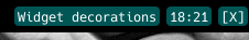
groupoption is that the group is dynamic meaning that it is drawn according to the widgets that are currently visible in the group. The group will adjust if a window becomes visible or hidden.decoration_group = { "decorations": [ RectDecoration(colour="#004040", radius=10, filled=True, padding_y=4, group=True) ], "padding": 10, } screens = [ Screen( top=Bar( [ extrawidgets.CurrentLayout(**decoration_group), widget.Spacer(), extrawidgets.StatusNotifier(**decoration_group), extrawidgets.Mpris2(**decoration_group), extrawidgets.Clock(format="%H:%M:%S", **decoration_group), extrawidgets.ScriptExit( default_text="[X]", countdown_format="[{}]", countdown_start=2, **decoration_group ), ] ), 28 ) ]
There are two groups in this config: Group 1 is the CurrentLayout widget. Group 2 is the StatusNotifier, Mpris2, Clock and ScriptExit widgets. The groups are separated by the Spacer widget.
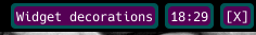
When there is no active icon in the StatusNotifier, the bar looks like this:

When there is an icon, the group is expanded to include the widget:

Note the group is not broken despite the Mpris2 widget having no contents.
- Groups are determined by looking for:
widgets using the identical configuration for the decoration
widgets in a consecutive groups
Groups can therefore be broken by changing the configuration of the group (e.g. by adding an additional parameter such as
group_id=1) or having an undecorated separator between groups.Setting
clip=Truewill result in the widget’s contents being restricted to the area covered by the decoration. This may be desirable for widgets likeALSAWidgetandBrightnessControlwhich draw their levels in the bar. NB clipping be be constrained to the area inside the outline line width.

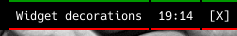
Single decoration

Two decorations stacked
key
default
description
clipFalseClip contents of widget to decoration area.
colour'#000000'Colour for decoration
extrawidth0Add additional width to the end of the decoration
filledFalseWhether to fill shape
groupFalseWhen set to True, the decoration will be applied as if the widgets were grouped. See documentation for more.
ignore_extrawidthFalseIgnores additional width added by decoration. Useful when stacking decorations on top of a PowerLineDecoration.
line_colour'#ffffff'Colour of border
line_width0Line width for decoration
padding0Default padding
padding_xNoneX Padding. Overrides ‘padding’ if set
padding_yNoneY Padding. Overrides ‘padding’ if set
radius4Corner radius as int or list of ints [TL TR BR BL]. 0 is square
use_widget_backgroundFalsePaint the decoration using the colour from the widget’s background property. The widget’s background will then be the bar’s background colour.