Popup Toolkit
Popup Toolkit Layouts
Layouts are the container that houses all the controls. In order to give the greatest flexibility to users, there are a number of different layouts available in the toolkit.
PopupAbsoluteLayout
- class qtile_extras.popup.toolkit.PopupAbsoluteLayout(qtile: Qtile | None = None, **config)[source]
The absolute layout is the simplest layout of all. Controls are placed based on the following parameters:
`pos_x`, `pos_y`: top left corner
`width`, `height`: size of control
No further adjustments are made to the controls.
Note: the layout currently ignores the
marginattribute i.e. a control placed at (0,0) will display there even if a margin is defined.key
default
description
background'000000'Popup background colour
border'111111'Border colour for popup
border_width0Popup border width
close_on_clickTrueHide the popup when control is clicked
controls[]Controls to display
height200Height of tooltip
hide_interval0.5Timeout after mouse leaves popup before popup is lilled
hide_on_mouse_leaveFalseHide the popup if the mouse pointer leaves the popup
hide_on_timeout0Timeout before popup closes (0 = disabled). Useful for notifications
initial_focus0Index of control to be focused at startup.
keyboard_navigationTrueWhether popup controls can be navigated by keys
keymap{'close': ['Escape'], 'down': ['Down', 'k'], 'left': ['Left', 'h'], 'right': ['Right', 'l'], 'select': ['Return', 'space'], 'step': ['Tab'], 'up': ['Up', 'j']}Keyboard controls. NB Navigation logic is very rudimentary. The popup will try to select the nearest control in the direction pressed but some controls may be inaccessible. In that scenario, use the mouse or Tab to cycle through controls.
margin5Margin around edge of tooltip
opacity1Popup window opacity. ‘None’ inherits bar opacity
width200Width of tooltip
PopupGridLayout
- class qtile_extras.popup.toolkit.PopupGridLayout(qtile, **config)[source]
The grid layout should be familiar to users who have used Tkinter.
In addition to the width and height attributes, the grid layout also requires rows and cols to define the grid. Grid cells are evenly sized.a
Controls can then be placed in the grid via the row, col, row_span and col_span parameters.
For example:
PopupGridLayout(rows=6, cols=6, controls=[
    PopupImage(filename="A",row=0, col=2, row_span=2, col_span=2),
    PopupImage(filename="B",row=2, col=2, row_span=2, col_span=2),
    PopupImage(filename="C",row=3, col=1),
    PopupImage(filename="D",row=3, col=4),
    PopupText(row=4,col_span=6),
])
would result in a tooltip looking like:
-------------------------
|   |   |       |   |   |
---------   A   ---------
|   |   |       |   |   |
-------------------------
|   |   |       |   |   |
---------   B   ---------
|   | C |       | D |   |
-------------------------
|         TEXT          |
-------------------------
|   |   |   |   |   |   |
-------------------------
row and col are both zero-indexed.
key
default
description
background'000000'Popup background colour
border'111111'Border colour for popup
border_width0Popup border width
close_on_clickTrueHide the popup when control is clicked
cols2Number of columns in grid
controls[]Controls to display
height200Height of tooltip
hide_interval0.5Timeout after mouse leaves popup before popup is lilled
hide_on_mouse_leaveFalseHide the popup if the mouse pointer leaves the popup
hide_on_timeout0Timeout before popup closes (0 = disabled). Useful for notifications
initial_focus0Index of control to be focused at startup.
keyboard_navigationTrueWhether popup controls can be navigated by keys
keymap{'close': ['Escape'], 'down': ['Down', 'k'], 'left': ['Left', 'h'], 'right': ['Right', 'l'], 'select': ['Return', 'space'], 'step': ['Tab'], 'up': ['Up', 'j']}Keyboard controls. NB Navigation logic is very rudimentary. The popup will try to select the nearest control in the direction pressed but some controls may be inaccessible. In that scenario, use the mouse or Tab to cycle through controls.
margin5Margin around edge of tooltip
opacity1Popup window opacity. ‘None’ inherits bar opacity
rows2Number of rows in grid
width200Width of tooltip
PopupRelativeLayout
- class qtile_extras.popup.toolkit.PopupRelativeLayout(qtile: Qtile | None = None, **config)[source]
The relative layout positions controls based on a percentage of the parent tooltip’s dimensions.
The positions are defined with the following parameters:
`pos_x`, `pos_y`: top left corner
`width`, `height`: size of control
All four of these parameters should be a value between 0 and 1. Values outside of this range will generate a warning in the log but will not raise an exception.
For example:
PopupRelativeLayout(rows=6, cols=6, controls=[
    PopupImage(filename="A",pos_x=0.1, pos_y=0.2, width=0.5, height=0.5)
])
Would result in a tooltip with dimensions of 200x200 (the default), with an image placed at (20, 40) with dimensions of (100, 100).
Note: images are not stretched but are, instead, centered within the rect.
key
default
description
background'000000'Popup background colour
border'111111'Border colour for popup
border_width0Popup border width
close_on_clickTrueHide the popup when control is clicked
controls[]Controls to display
height200Height of tooltip
hide_interval0.5Timeout after mouse leaves popup before popup is lilled
hide_on_mouse_leaveFalseHide the popup if the mouse pointer leaves the popup
hide_on_timeout0Timeout before popup closes (0 = disabled). Useful for notifications
initial_focus0Index of control to be focused at startup.
keyboard_navigationTrueWhether popup controls can be navigated by keys
keymap{'close': ['Escape'], 'down': ['Down', 'k'], 'left': ['Left', 'h'], 'right': ['Right', 'l'], 'select': ['Return', 'space'], 'step': ['Tab'], 'up': ['Up', 'j']}Keyboard controls. NB Navigation logic is very rudimentary. The popup will try to select the nearest control in the direction pressed but some controls may be inaccessible. In that scenario, use the mouse or Tab to cycle through controls.
margin5Margin around edge of tooltip
opacity1Popup window opacity. ‘None’ inherits bar opacity
width200Width of tooltip
Popup Toolkit Controls
Controls are the building blocks for your popup. You can place text, images and progress bars and have each of these react to input events or display information dynamically.
PopupCircularProgress
- class qtile_extras.popup.toolkit.PopupCircularProgress(value=None, **config)[source]
Draws a circular progress bar.
colour_belowshould be used to set the colour of the progress bar whilecolour_abovewill draw a background ring.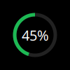
Note
This is a special control that is designed to be used in conjunction with other controls. By default,
clipis set toTruewhich means that only the area that would be covered by the full circular progress bar is drawn i.e. there is no rectangular background to this control. The result is that any control underneath the circular progress bar is visible.To place this control above another, it should be defined after that control. For example:
layout = PopupRelativeLayout(
    controls=[
        PopupImage(...),  # image to display beneath progress bar
        PopupCircularProgress(...)
    ]
)
key
default
description
backgroundNoneBackground colour for control
bar_border_colour'ffffff'Colour of border drawn around bar
bar_border_margin0Size of gap between border and bar
bar_border_size0Thickness of border around bar
bar_size2Thickness of bar
can_focus'auto'Whether or not control can be focussed. Focussed control will be highlighted if highlight attribute is set. Possible value are: True, False or ‘auto’ (which sets to True if a ‘Button1’ mouse_callback is set).
clipTrueWhen
Truethe drawing area is limited to the circular progress bar. This allows the progress bar to be placed on top of other controls and still show their content.clockwiseTrueProgress increases in a clockwise direction.
col0Column position (for grid layout)
col_span1Number of columns covered by control
colour_above'#888888'Colour for bar above value
colour_below'#ffffff'Colour for bar below value
drag_callbackNoneCallback to run after dragging slider. Callback should take a single argument
new_value.end_margin5Gap between edge of control and ends of the bar/border
height50height of control
highlight'#006666'Highlight colour
highlight_border2Border width for focused controls
highlight_method'block'How to highlight focused control. Options are ‘border’ and ‘block’.
highlight_radius5Corner radius for highlight
horizontalTrueOrientation. False = vertical
marker_colour'#bbbbbb'Colour of marker
marker_size10Size of marker
max_value1.0Maximum value
min_value0Minimum value
mouse_callbacks{}Dict of mouse button press callback functions. Accepts lazy objects.
nameNoneA unique name for the control. Is only necessary if you wish to update the control’s value via
popup.update_controls().pos_x0x position of control
pos_y0y position of control
row0Row position (for grid layout)
row_span1Number of rows covered by control
start_angle0Starting angle (in degrees) for progress marker. 0 is 12 o’clock and angle increases in a clockwise direction.
width50width of control
PopupImage
- class qtile_extras.popup.toolkit.PopupImage(**config)[source]
Control to display an image.
Image will be scaled (locked aspect ratio) to fit within the control rect. The image will also be centered vertically and horizontally.
key
default
description
backgroundNoneBackground colour for control
can_focus'auto'Whether or not control can be focussed. Focussed control will be highlighted if highlight attribute is set. Possible value are: True, False or ‘auto’ (which sets to True if a ‘Button1’ mouse_callback is set).
col0Column position (for grid layout)
col_span1Number of columns covered by control
colour'ffffff'Colour to use to fill image when using mask mode
filenameNonepath to image file.
height50height of control
highlight'#006666'Highlight colour
highlight_border2Border width for focused controls
highlight_filenameNonepath to image to be displayed when highlight method is ‘image’
highlight_method'block'How to highlight focused control. Options are ‘image’, ‘border’, ‘block’ and ‘mask’.
highlight_radius5Corner radius for highlight
maskFalseUse the image as a mask
mouse_callbacks{}Dict of mouse button press callback functions. Accepts lazy objects.
nameNoneA unique name for the control. Is only necessary if you wish to update the control’s value via
popup.update_controls().pos_x0x position of control
pos_y0y position of control
row0Row position (for grid layout)
row_span1Number of rows covered by control
width50width of control
PopupSlider
- class qtile_extras.popup.toolkit.PopupSlider(value=None, **config)[source]
Control to display slider/progress bar.
Bar can be displayed horizontally (draws left-to-right) or vertically (bottom-to-top).
In addition, a border can be drawn around the bar using the
bar_border_colour/size/marginparameters.key
default
description
backgroundNoneBackground colour for control
bar_border_colour'ffffff'Colour of border drawn around bar
bar_border_margin0Size of gap between border and bar
bar_border_size0Thickness of border around bar
bar_size2Thickness of bar
can_focus'auto'Whether or not control can be focussed. Focussed control will be highlighted if highlight attribute is set. Possible value are: True, False or ‘auto’ (which sets to True if a ‘Button1’ mouse_callback is set).
col0Column position (for grid layout)
col_span1Number of columns covered by control
colour_above'#888888'Colour for bar above value
colour_below'#ffffff'Colour for bar below value
drag_callbackNoneCallback to run after dragging slider. Callback should take a single argument
new_value.end_margin5Gap between edge of control and ends of the bar/border
height50height of control
highlight'#006666'Highlight colour
highlight_border2Border width for focused controls
highlight_method'block'How to highlight focused control. Options are ‘border’ and ‘block’.
highlight_radius5Corner radius for highlight
horizontalTrueOrientation. False = vertical
marker_colour'#bbbbbb'Colour of marker
marker_size10Size of marker
max_value1.0Maximum value
min_value0Minimum value
mouse_callbacks{}Dict of mouse button press callback functions. Accepts lazy objects.
nameNoneA unique name for the control. Is only necessary if you wish to update the control’s value via
popup.update_controls().pos_x0x position of control
pos_y0y position of control
row0Row position (for grid layout)
row_span1Number of rows covered by control
width50width of control
PopupText
- class qtile_extras.popup.toolkit.PopupText(text='', **config)[source]
Simple control to display text.
key
default
description
backgroundNoneBackground colour for control
can_focus'auto'Whether or not control can be focussed. Focussed control will be highlighted if highlight attribute is set. Possible value are: True, False or ‘auto’ (which sets to True if a ‘Button1’ mouse_callback is set).
col0Column position (for grid layout)
col_span1Number of columns covered by control
font'sans'Font name
fontsize12Font size
foreground'#ffffff'Font colour
foreground_highlightedNoneFont colour when highlighted via block (None to use foreground value)
h_align'left'Text alignment: left, center or right.
height50height of control
highlight'#006666'Highlight colour
highlight_border2Border width for focused controls
highlight_method'block'Available options: ‘border’, ‘block’ or ‘text’.
highlight_radius5Corner radius for highlight
markupFalseEnable pango markup
mouse_callbacks{}Dict of mouse button press callback functions. Accepts lazy objects.
nameNoneA unique name for the control. Is only necessary if you wish to update the control’s value via
popup.update_controls().pos_x0x position of control
pos_y0y position of control
row0Row position (for grid layout)
row_span1Number of rows covered by control
v_align'middle'Vertical alignment: top, middle or bottom.
width50width of control
wrapFalseWrap text in layout
PopupWidget
- class qtile_extras.popup.toolkit.PopupWidget(**config)[source]
Control to display a Qtile widget in a Popup window.
Mouse clicks are passed on to the widgets.
Currently, widgets will be sized based on the dimensions of the control. This will override any width/stretching settings in thw widget.
key
default
description
backgroundNoneBackground colour for control
can_focus'auto'Whether or not control can be focussed. Focussed control will be highlighted if highlight attribute is set. Possible value are: True, False or ‘auto’ (which sets to True if a ‘Button1’ mouse_callback is set).
col0Column position (for grid layout)
col_span1Number of columns covered by control
height50height of control
highlight'#006666'Highlight colour
highlight_border2Border width for focused controls
highlight_method'block'How to highlight focused control. Options are ‘border’ and ‘block’.
highlight_radius5Corner radius for highlight
horizontalTrueWidget is horizontal. False = vertical.
mouse_callbacks{}Dict of mouse button press callback functions. Accepts lazy objects.
nameNoneA unique name for the control. Is only necessary if you wish to update the control’s value via
popup.update_controls().pos_x0x position of control
pos_y0y position of control
row0Row position (for grid layout)
row_span1Number of rows covered by control
vertical_leftTrueIf using vertical orientation, mimic bar on left hand side of screen (causes text to read from bottom to top).
widgetNoneWidget instance.
width50width of control